2024 | Tallinn AirportInterior DesignEnvironmental
Tallinn Airport Business reLounge
Pop-up space with little trace
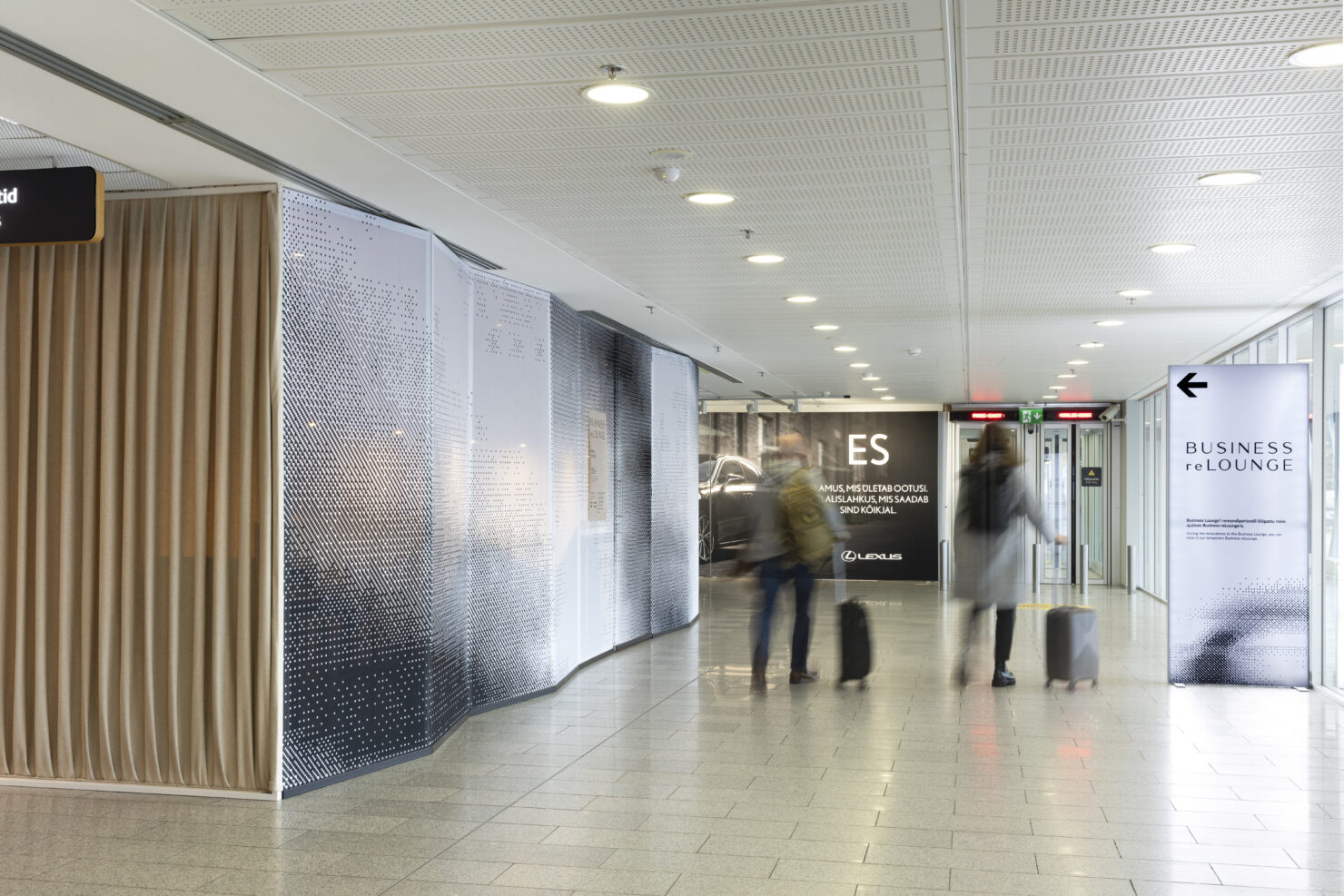
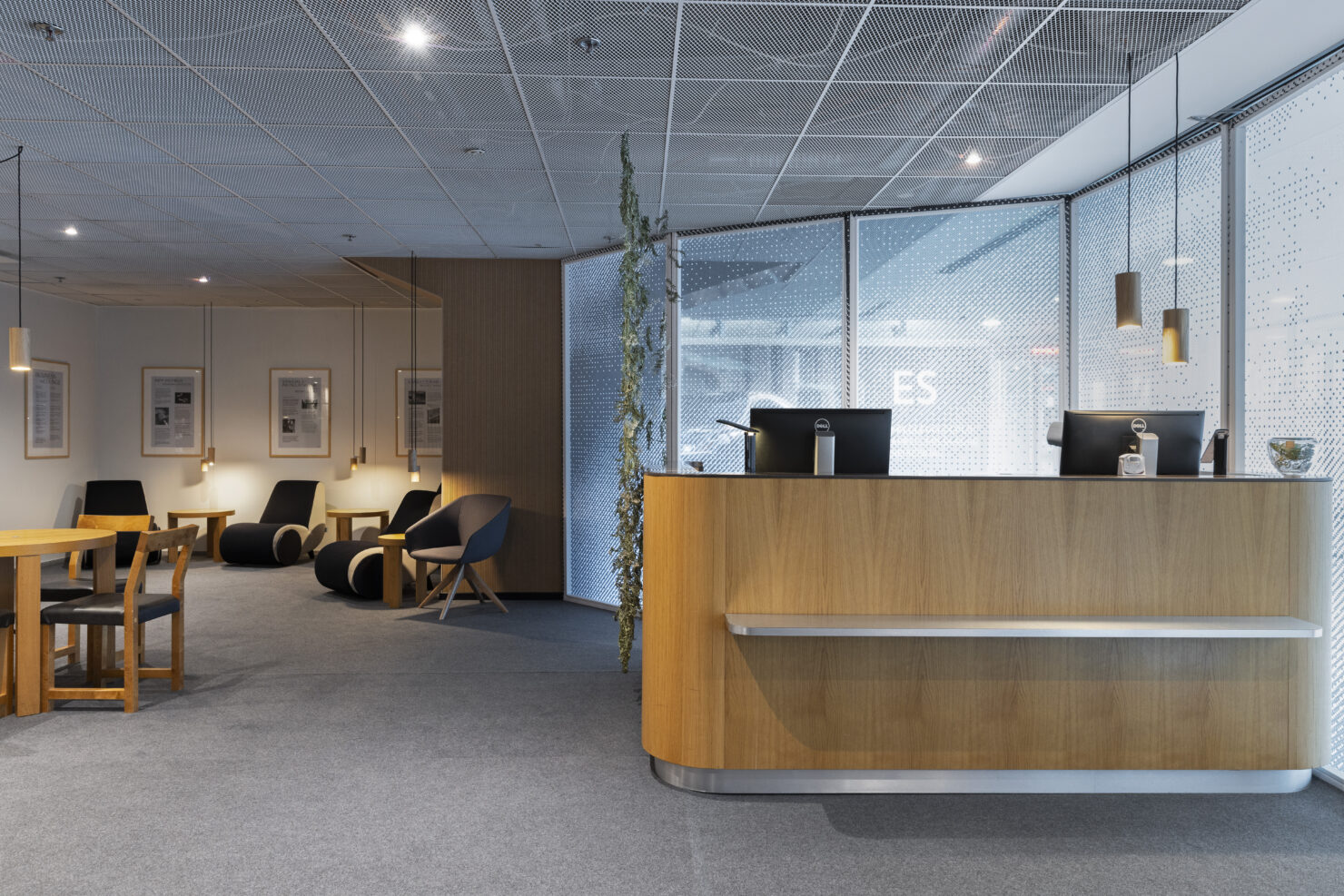
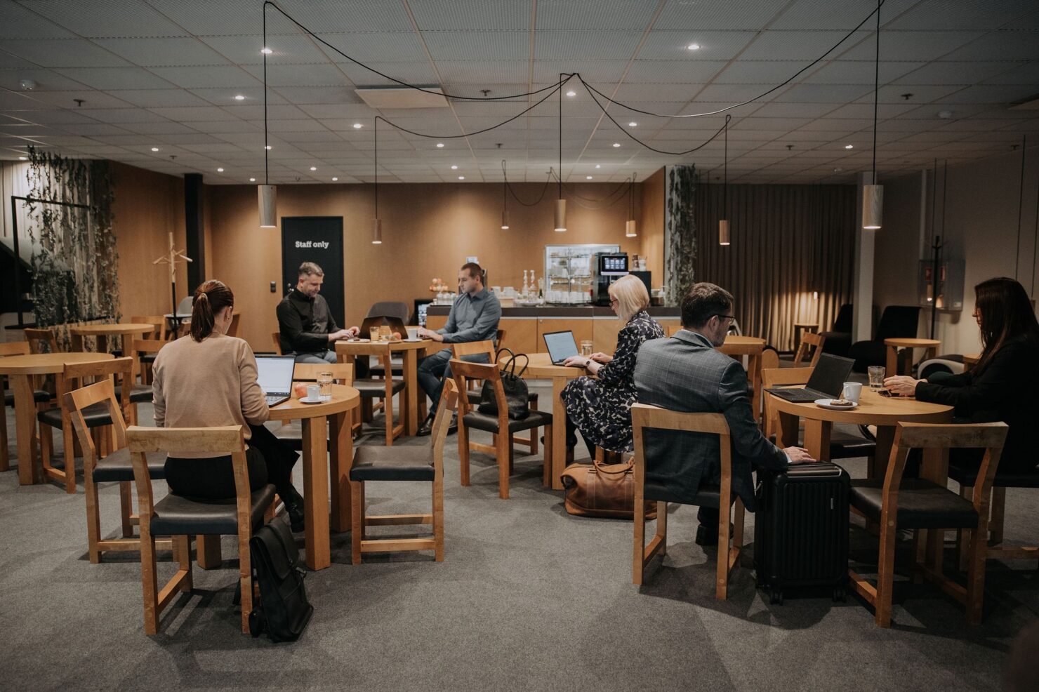
The Tallinn Airport Business Lounge provides a space for travellers to relax, work, and enjoy food and refreshments, away from the hustle and bustle of the rest of the airport. As the original lounge was going through a transformation, we had to temporarily relocate these functionalities to an open area of the terminal.
We quickly reached a mutual understanding with the airport that this pop-up needed to be done sensibly – making the most of what we already had and adding as little as possible, without compromising the service or sacrificing a relaxing aesthetic. This is how Business reLounge came to life.
One layer, instead of five
Since people are moving both inside and around the reLounge, it had to be enclosed from the rest of the airport in a way that looks good from both sides. We decided not to build framed walls covered in sheet material, which would then need finishing on both sides.
What would we do with these custom walls after 4 months anyway?
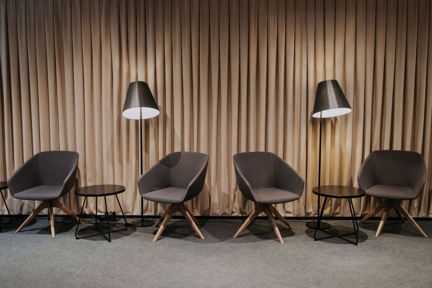
We found that achieving the look and feel of a wall could be accomplished with a single layer of recycled wool which also bears some acoustic qualities. The fabric was sewn into pleats using flat felled seams and fixed to strips of wood, which were temporarily fixed to the floor and ceiling. It can later be stripped, unpleated, and made into warm blankets that the airport needs for their storage in case of emergencies.
Designing a pattern for two scales
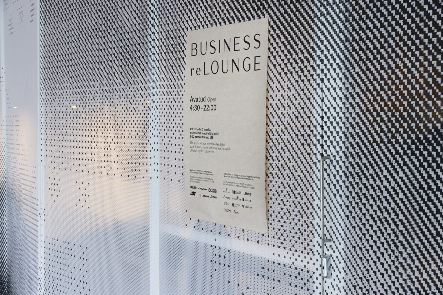
The entrance wall is facing the windows of the terminal. We looked for translucent fabric to preserve some of that natural daylight while at the same time shielding the customers from the gazes of the passersby. The screens are made from storm-proof mesh leftovers saved from a print shop’s fabric roll ends.
We created a custom pattern for it to increase privacy in the space. After being used in the reLounge, the mesh will be reused to make totebags for the airport. The graphic designer had to take that into consideration and we tested the pattern already in the design process both in a bag size and as a wall.
Use full sheets, avoid glue
An important requirement to repeatedly use materials is to keep them clean, as big in size and width as possible, and to use temporary fixing solutions. All the fabrics used in the reLounge are stapled to timber so we can easily deattach them after the pop-up is taken down and sew them into new items.
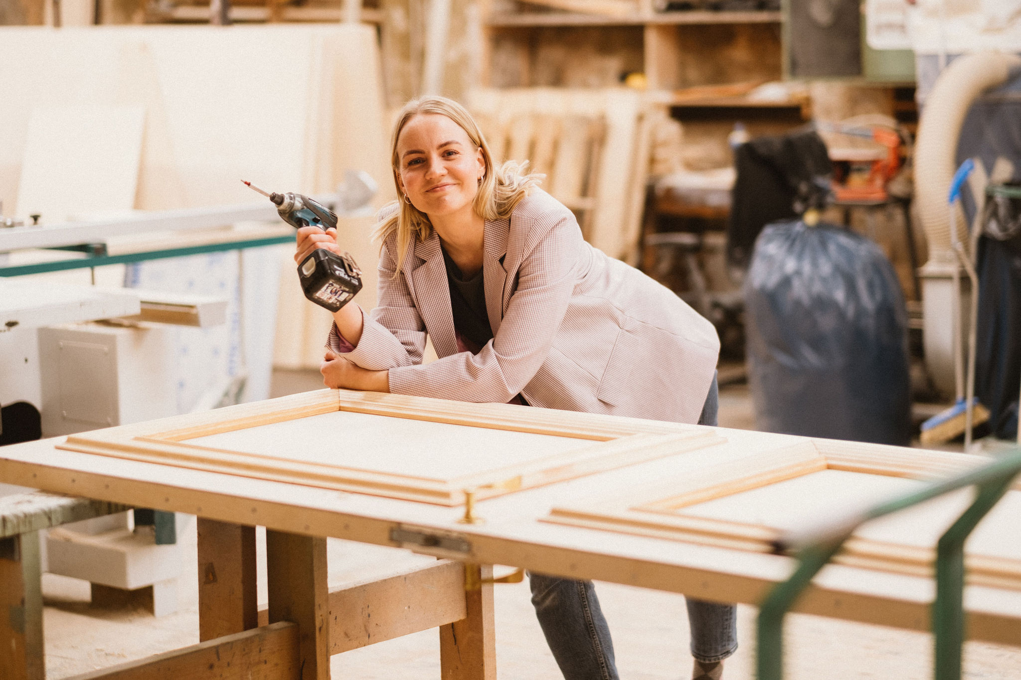
The wood can then be reused as well. We taped almost full MDF sheets to the walls of the reLounge to unify some of the different finishings the room had before. On top of that, most of the timber pieces used are fixed to the floor with removable tape. This makes for easier disassembly. Very few screws were used here and there for safety.
Hanging outlets
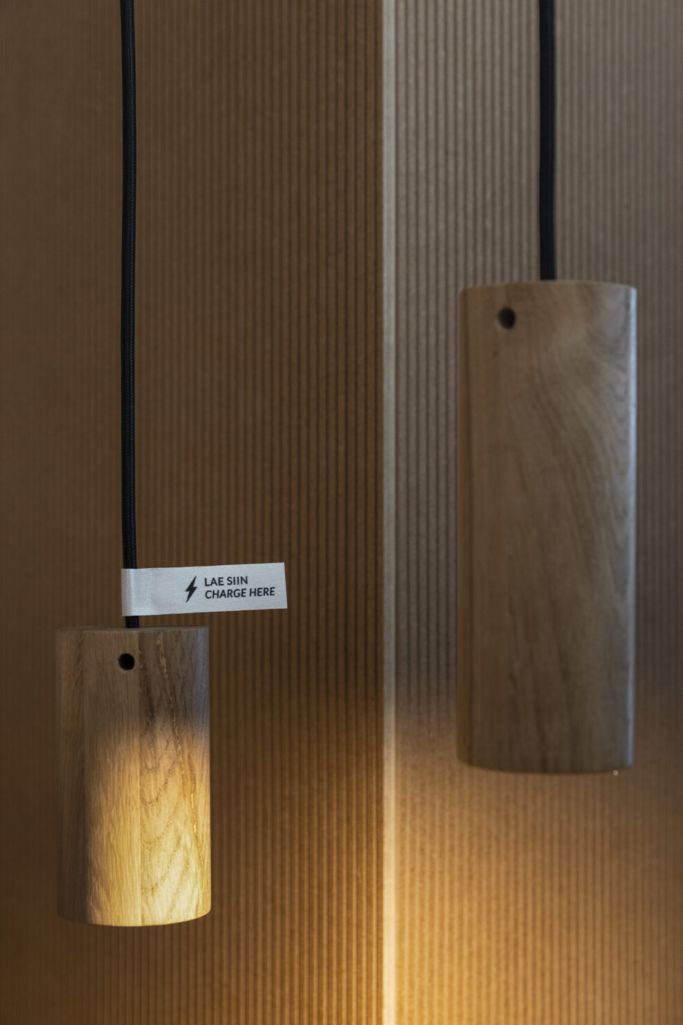
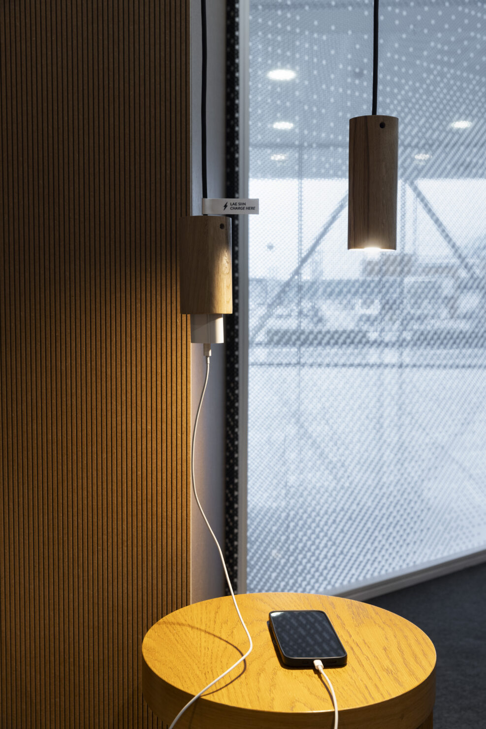
Since the area was a bit dark, we knew we needed additional spot lights. Additionally, we wanted to provide convenient charging stations for travellers. Since we could only bring electricity from the ceiling, special hanging outlets were designed in cooperation with PULO. All the light and outlet sockets are made from the floor industry wood scraps. You can make one socket out of a couple of small floor board pieces.
Rent or circulate
- The lights are rented and will be returned to their producer to use in future projects.
- The house-shaped sound-absorbing furniture is rented and will travel to a showroom in the Netherlands after its service in the reLounge.
- The carpet will go back to the seller.
- The MDF sheets covering some of the walls will go to a workshop to be used to build furniture.
Workshops usually have great uses for clean, reasonably-sized material leftovers, so you can always ask the sellers or producers whether they want them back. At first, they might look at you a bit funny because they’ve just sold the stuff to you, but they’ll probably be happy to take and reuse them.
Don’t be scared of brown
The beautiful, dried plant installations in our reLounge were handcrafted using ferns from the local Pääsküla bog. Using dried plants, existing furniture and unfinished materials might mean you have to make compromises as a designer. It definitely requires a lot of measuring, piecing the space together like a puzzle and letting go of perfection but what is great about this project – every project meeting we had ended with sparks in our eyes and a thirst to produce sensibly because it requires more from you and that’s exciting.
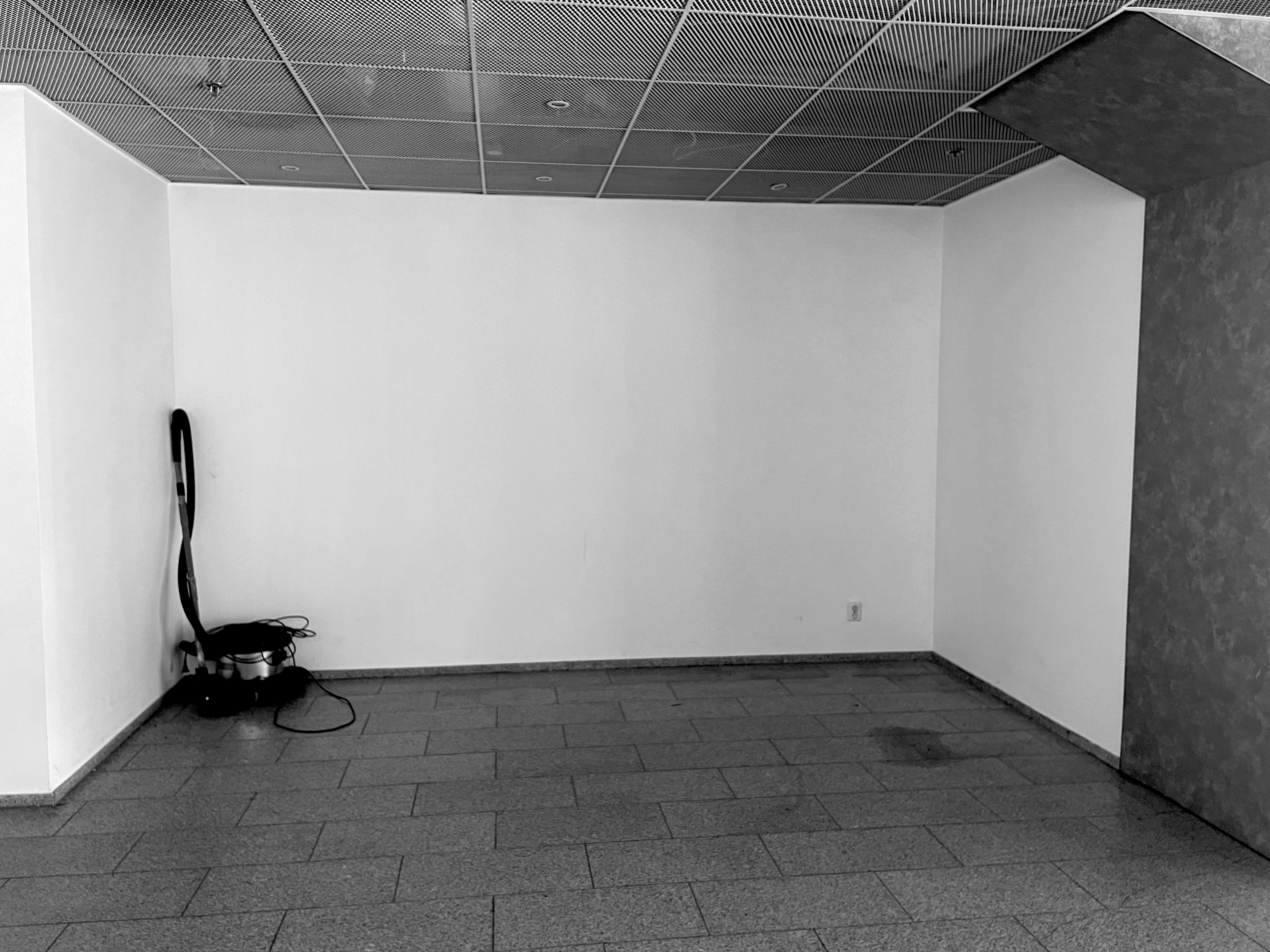
If doesn’t need to be there, don’t do it. If it needs to be there, do it with less. If you can’t do it with less, consider what’s already there. And most importantly, make sure you think about what happens after you’ve done it.
There’s a journey ahead of us to implement and perfect this principle in every pop-up project we do, but we’re proud of really giving all the details a think and a rethink even unasked.
Team
- Kristel Linnutaja – Designer, Production manager
- Kersti Küla – Project lead
- Siim Tikk – Graphic designer
- Kevin Laus – 3D-designer
Partners
- Ester Rõuk, Erle Reinsalu, Aet Härmaorg – Tallinn Airport team
- Kristi Tiido, Liis Paavel (Phére) – Plant installations
- Karina Tõeleid (Lipuvabrik), Age Luiga (Kiu) – Prints
- Häly Kont (Aastakäik OÜ) – Curtains
- Mart Jõhvikas (Borg) – Sound-absorbing furniture
- Riho Vane, Kalle Loorand (RKV Ehitus) – Builders
- Mario Lerner (Funrent) – Flooring
- XOfoto, Cärol Liis Metsla – Photographers
