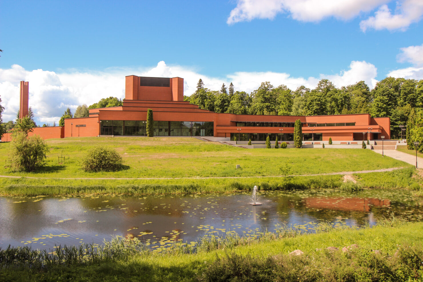
2020 | Ugala TheatreEnvironmentalWayfinding
Ugala Theatre wayfinding and branding
the project, that showed us how the simplest answer is sometimes the right answer
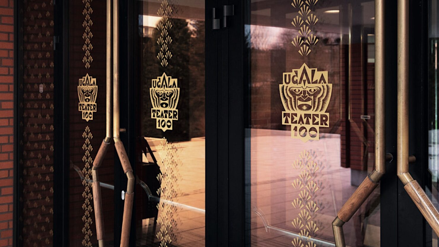
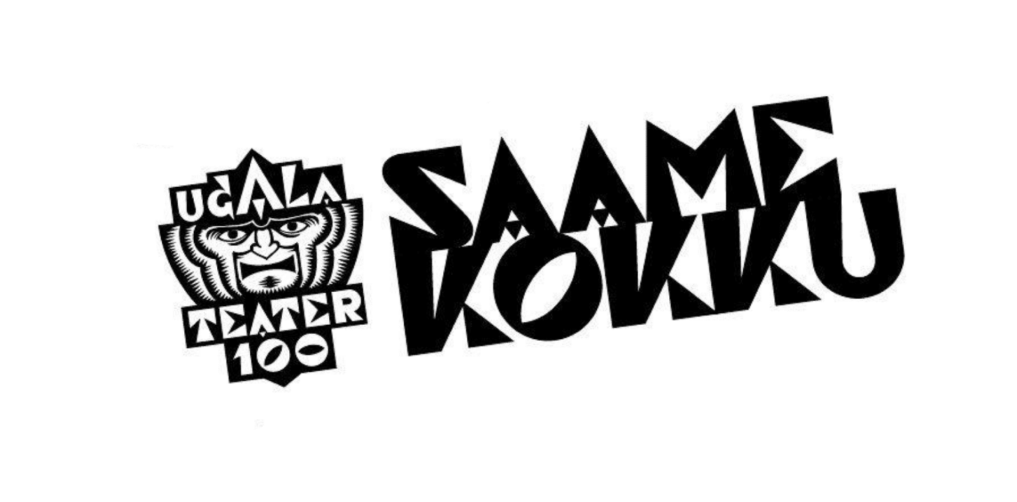
Ugala asked us to design a logo for their 100th anniversary. When we presented our designs at Ugala theatre, we noticed that their new and improved building was a bit absent on the wayfinding side of things. So we asked them about it.
Architects had ruled out the use of regular signage and wayfinding.
After learning about the obstacles and fears of our client, we started to work. Our main goal was to design a signage system, that would compliment the new theatre interior and help the guests, well…find their way. Our designer Kaarel found that way (probably the most simplest way we have ever seen).
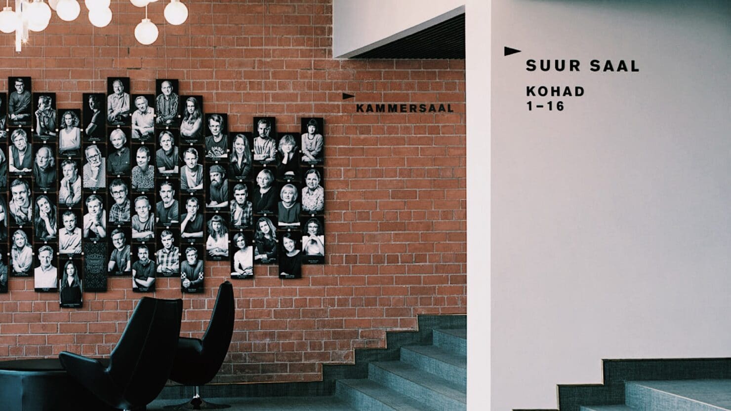
He analysed the Ugala theatre’s logo and saw, that it is essentially made out of arrows. Arrows, that have been part of this house as long as the theatre itself.
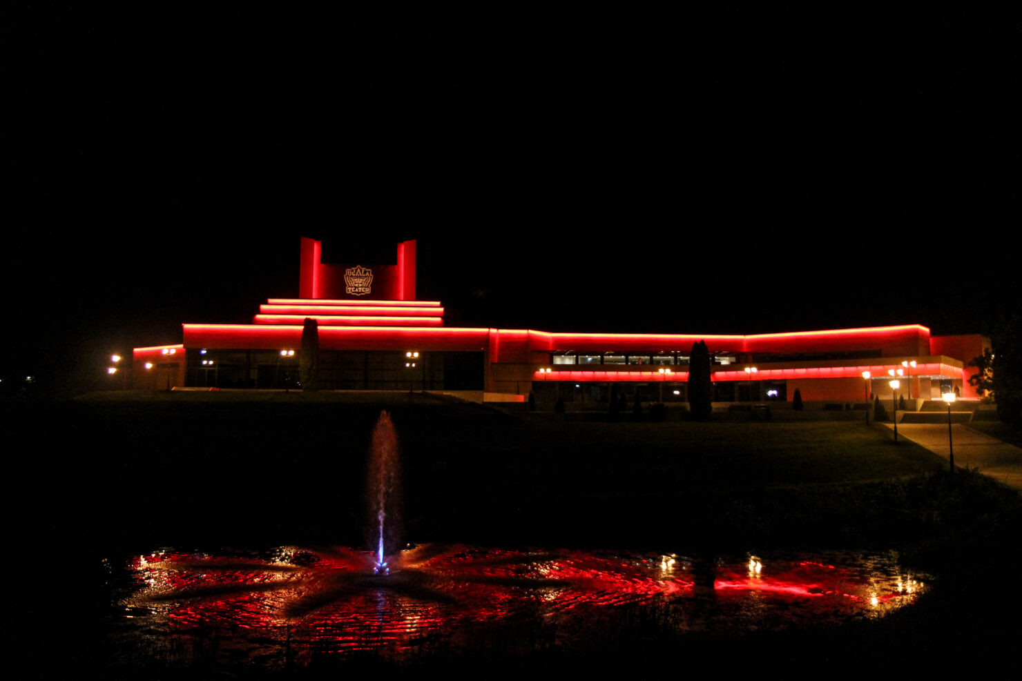
Since the architect did not allow any signs on the building, we used a projector to project Ugala Theatre logo on the wall.
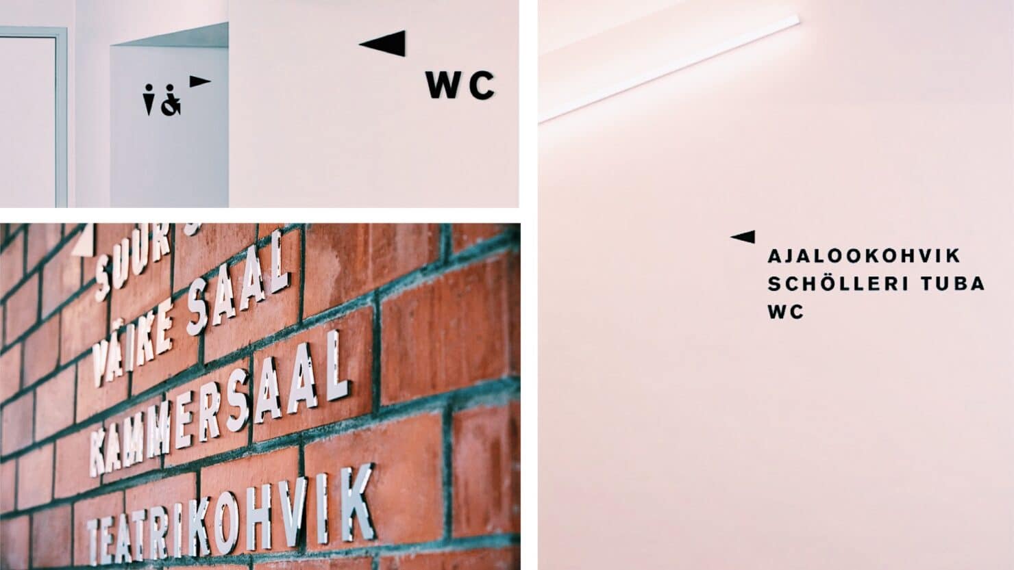
The plan was simple. Use the typeface of Ugala brand and merge it with the arrows found from the logo.
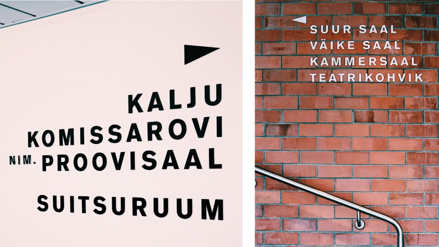
When we had the design on point, we then worked our way through our guests’ journey and used the minimal signage to create a wayfinding system that helps our customers and at the same time compliments the architecture.
This time… less really was more.
PS! We also designed a kick-ass anniversary logo.
Team
- Kaarel Vahtramäe – Design & Creative Lead
- Kadri Pukk – Wayfinding & Project Management
- Alan Reiss – Production Lead
