2019 | Port of TallinnEnvironmentalInterior GraphicsWayfinding
Terminal D – empathetic wayfinding 101
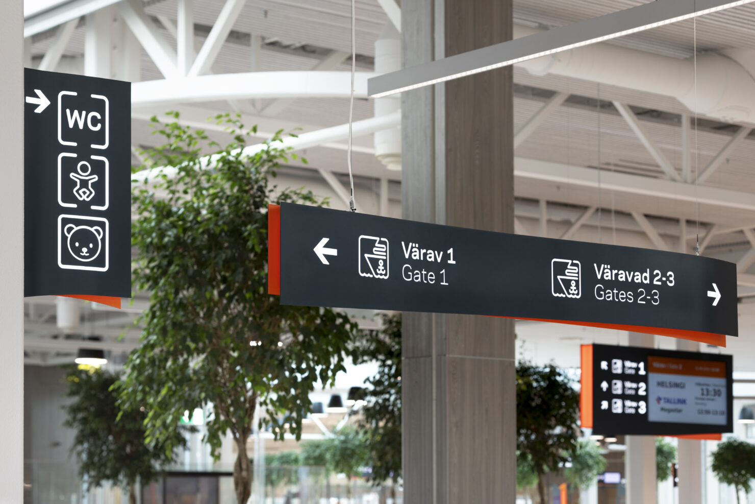
When Terminal D at Port of Tallinn started their renovation, they had one small problem. They wished to create a harbour, that would connect the strict rules of the sea with the softness of being on a vacation. At this moment they decided to contact Velvet.
Our task was to create a softer and more humane design, that would make travellers feel welcomed and relaxed inside the harbour. To accomplish that, we went through a 3 step process.
First step – empathy
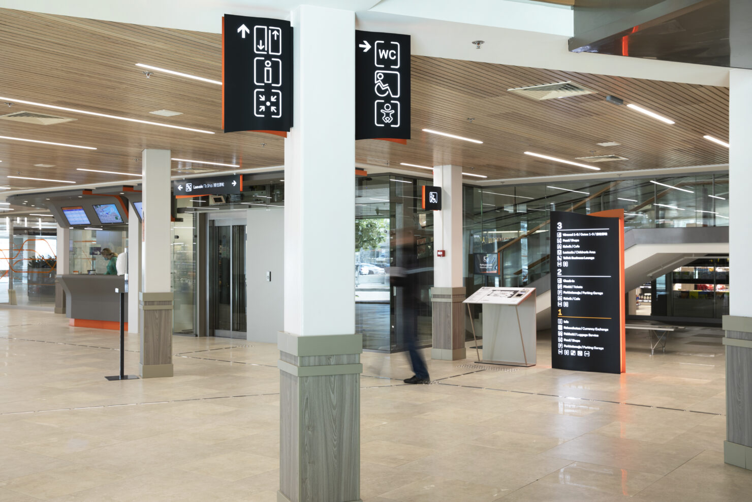
In order to make every traveller feel good in the terminal, we need to solve their problems before they can even think of one. For that, we mapped out all the possible paths our travellers, staff and guests could take and created a wayfinding system that would help them throughout the building.
Second step – design
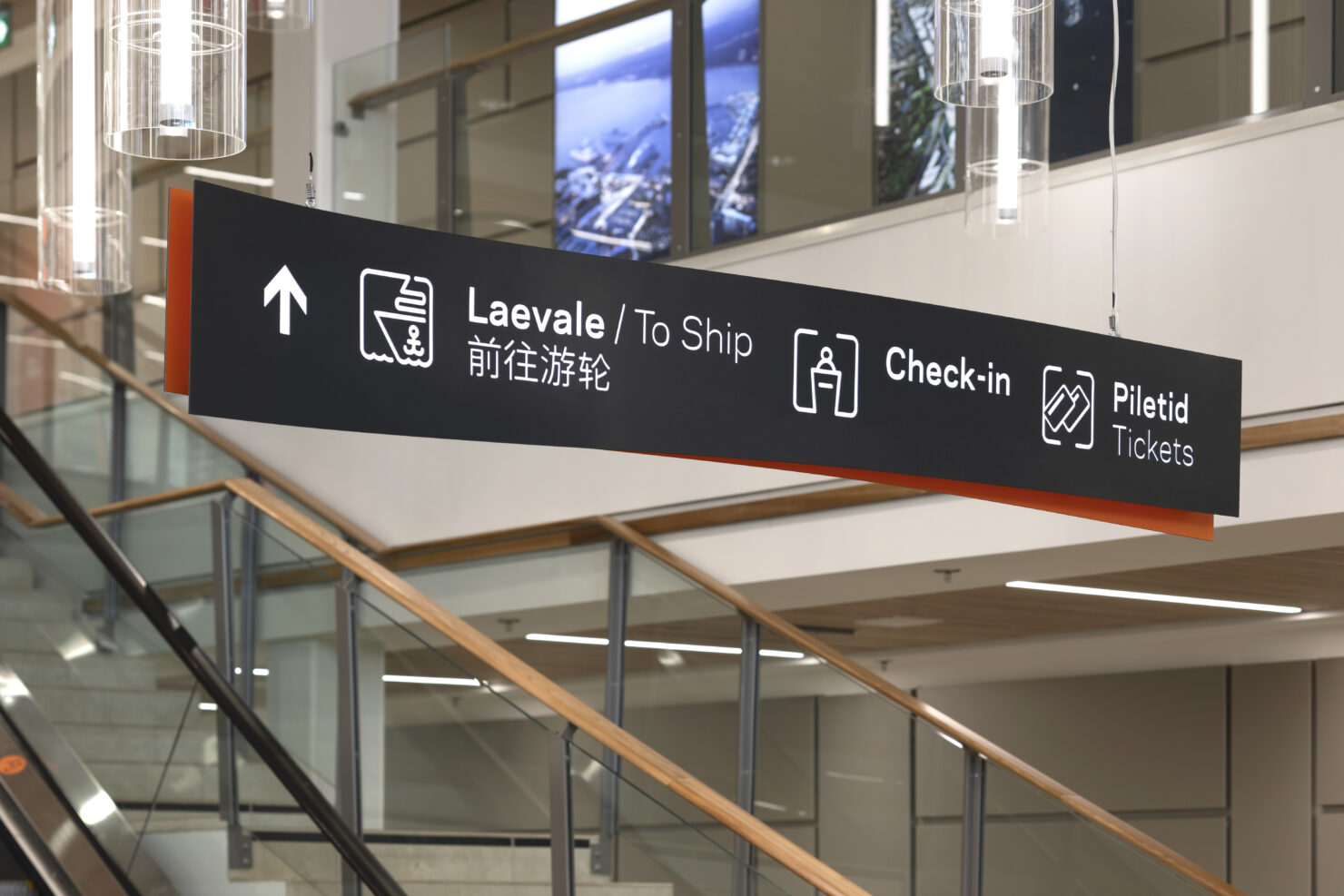
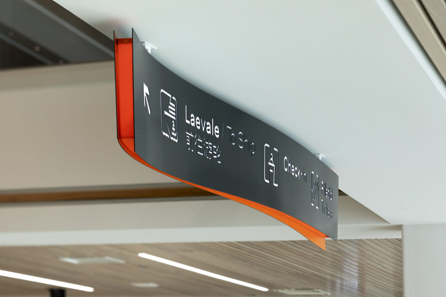
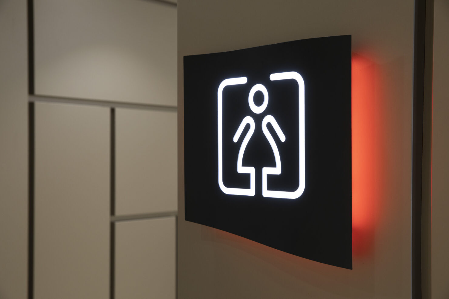
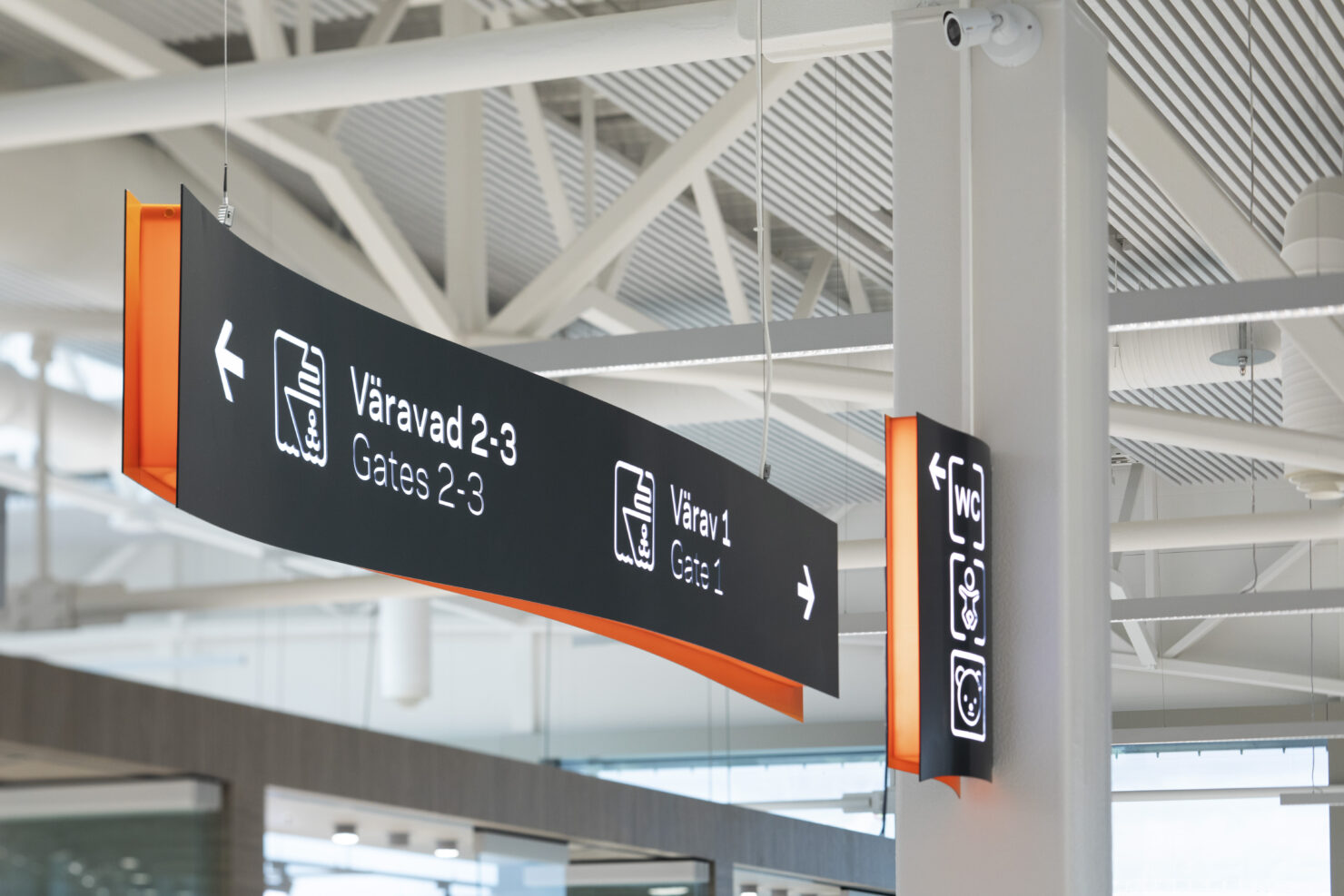
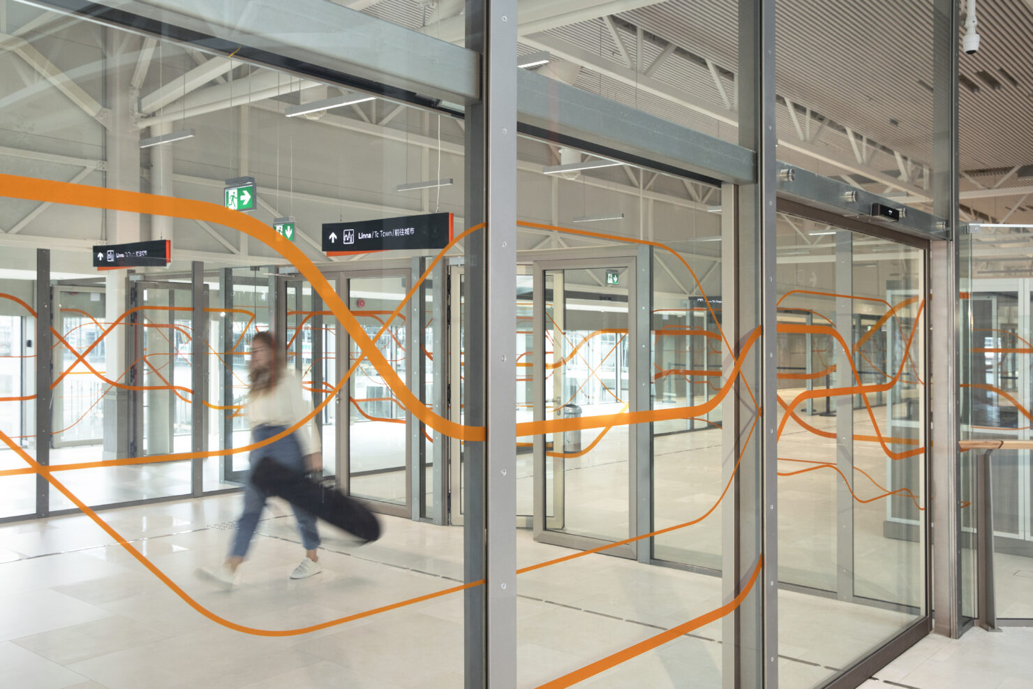
After realising the needs of our travellers, we started to design the signage. It needed to be clear and universally understandable but also create a softer touch for the interior design.
Third step – production
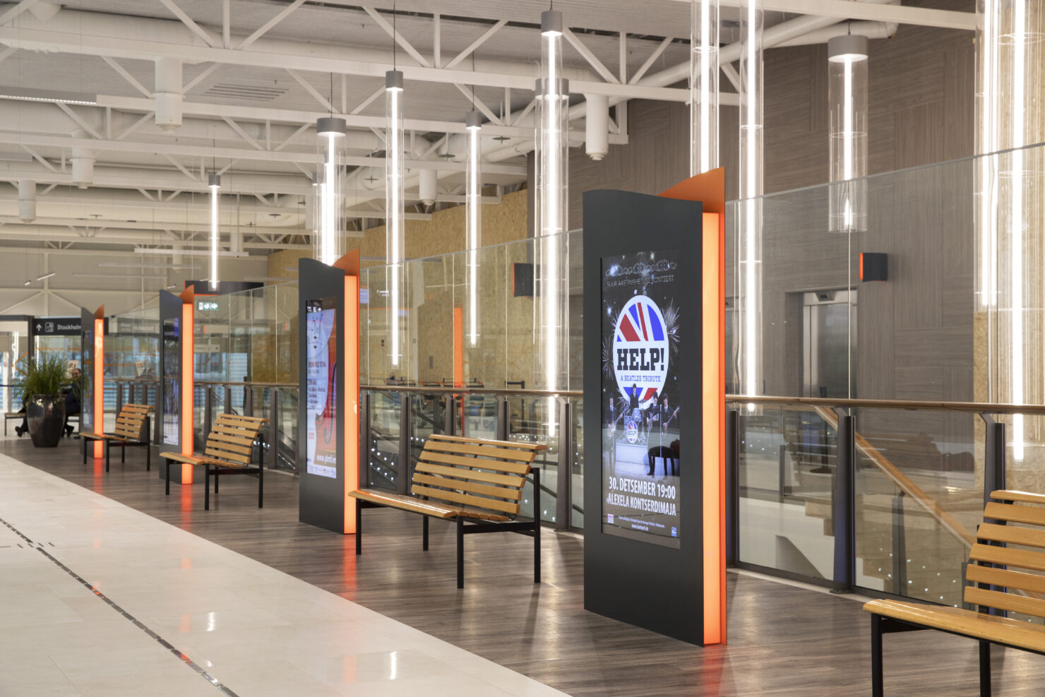
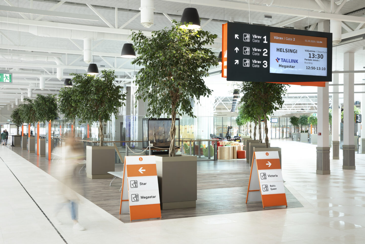
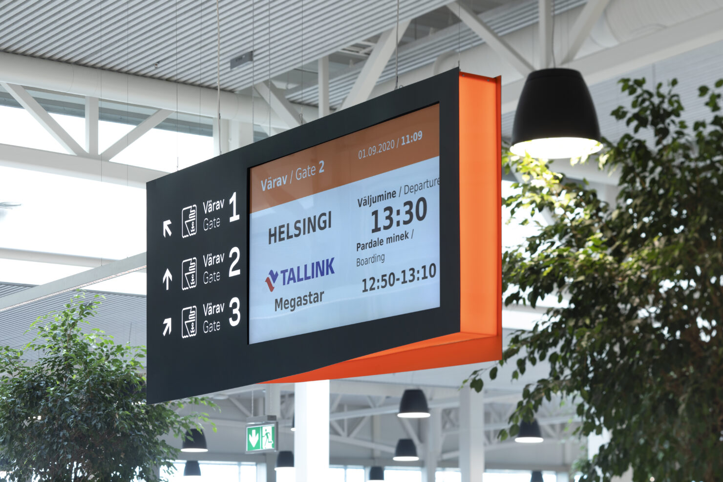
All this work would have been for nothing, if we had not produced it 100%. That is why we designed, produced and put in place all the signage and even created a system for emergency informations (goodbye, good old A4 paper-madness). Thanks to Ampron digital screens and advanced software, we could also extend our signage system to the docking area.
A true XL project!
Creating a wayfinding concept, mapping it and then producing it on this scale was one of our biggest environmental design projects so far. It certainly was a challenge and taught us how to better understand our target audience and seamlessly work with architects.
Team
- Sandra Goroško – Creative Lead
- Jaak Peep – Designer
- Kadri Pukk – Wayfinding
- Alan Reiss – Project Lead
- Mart Lankots – Production
Partners
- R-Konsult – Architects
