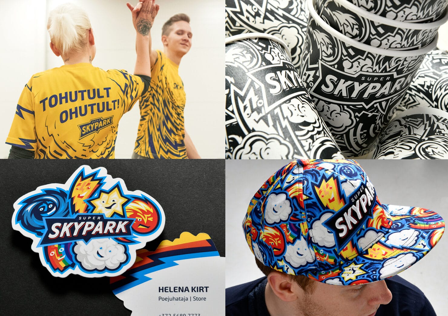
2019 | Super SkyParkGraphicEnvironmentalStrategicInterior GraphicsWayfindingBrandingIllustrationService DesignUser Research
Super Skypark – an entertainment centre for the whole family
or how we proved to ourselves and others that to reach next-level results you need the next generation.
When you’re sitting across from a client, whose eyes are sparkling from excitement and who is nearly bursting with the need to start the project; who says to you: “We’ve decided to take our business to the next level and create this region’s biggest family entertainment centre,” then… Well, we took a moment to think about it. Oh, not to consider whether working with such loons is a good idea or not – we needed the moment simply to pick out the right equipment and stock up on fuel.
Freedom from rules grants kids pure joy of play
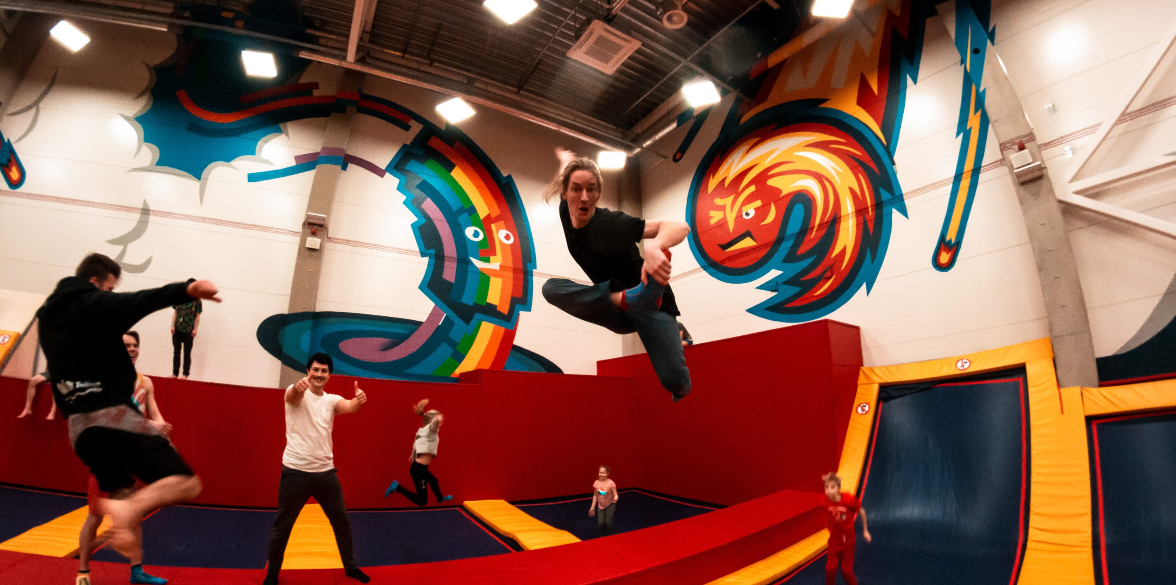
The main fuel, the source of inspiration and our most honest critics during the creation of Super Skypark’s brand and environmental graphics was the same group we were doing this for. Kids. When we observed and talked with kids in Skypark’s trampoline centre (the predecessor of Super Skypark), they gave us the starting point for all of our following work: kids loved this place because there they felt free. None of the everyday “Don’t scream!” or “Don’t jump” or “Don’t…” utterances reached into the Skypark to harass the kids here. This freedom granted them pure joy, the joy of play.
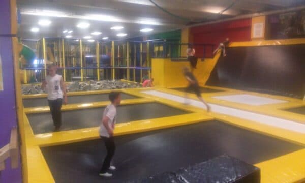
As a short aside – we learned all sorts of interesting things during our user research stage. Kids insisted that on these trampolines you bounce better! Afterwards we did in fact learn that this is absolutely true – these aren’t any regular run-of-the-mill trampolines, the Skypark trampolines were produced in Estonia and have a high bounce quality. Obviously this is a subject that should be broadcast louder in brand communication. Our second eureka moment arrived after we’d observed real life and talked with parents. We saw that even though the birthday rooms are mostly designed for kids (with their tiny cutesy-wutesy chairs and Lotte-themed murals), the people who spend most time in these rooms are actually parents. Standing up for their rights can raise the popularity of a playroom considerably.
In a world without rules, superheroes lead by example
Let’s return to designing a brand and environment and creating joy of play. Skypark gained the kid’s respect by giving them the freedom to make their own rules. Yeah… Doesn’t a lack of rules lead to the darker side of anarchy? Where are the educational aspects? These questions (and more) were posed by the parents in our heads. The same voice gave us the answer – if there are no rules, we make do with positive examples. Thus the concept of Superheroes was born. From then on it was smooth sailing (uh… at least for a while but we’ll get to that later).
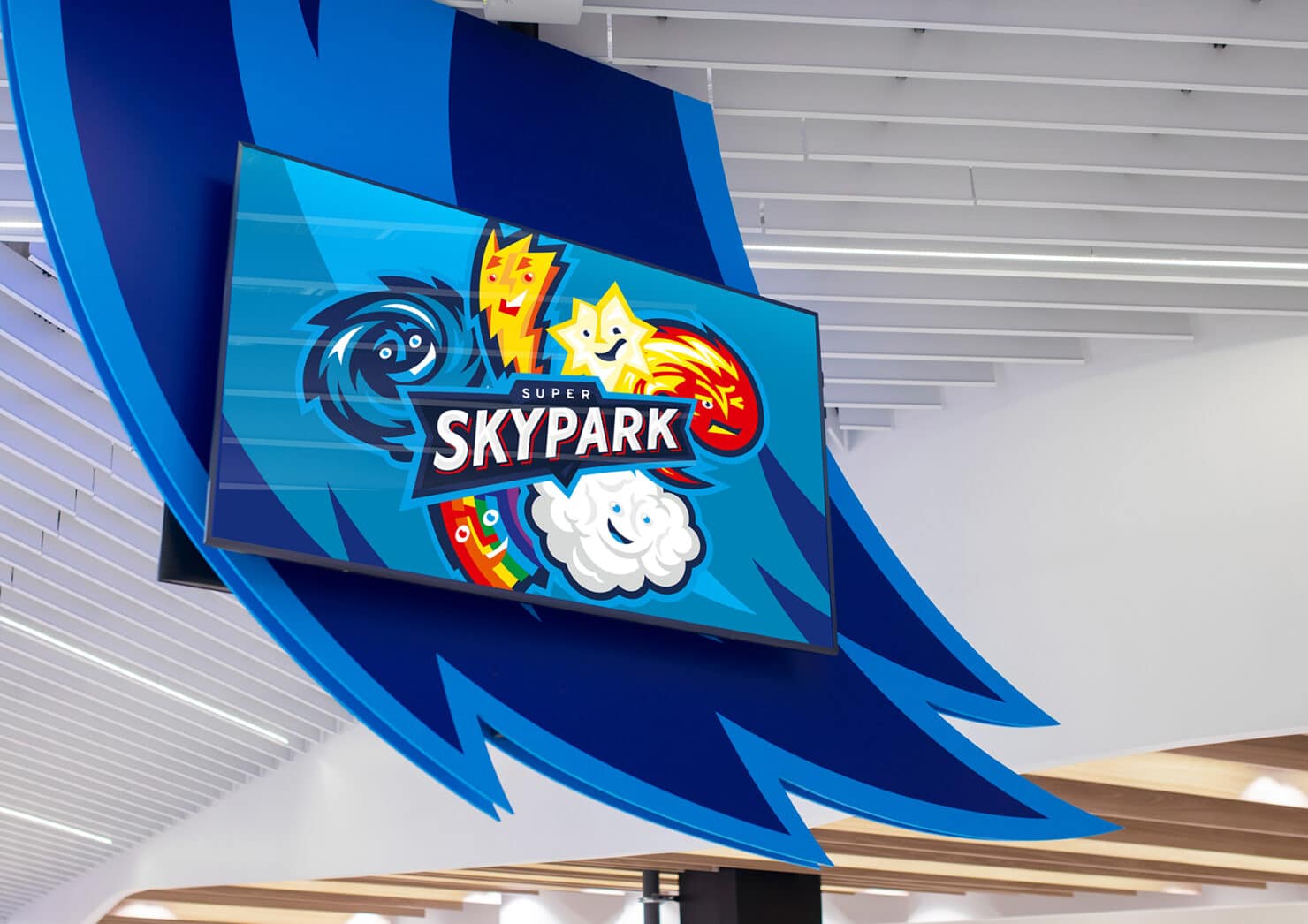
The concept of superheroes gave us the key to many decisions. Firstly – the heroes would be based on celestial phenomenon, because this is a Skypark. Sky has to remain in the new name because the heroes are of celestial origin. And the new Skypark should be called Super Skypark, because of the celestial phenomenon and superheroes and the next-level-ness of this entertainment centre. A masterclass of puzzling, indeed. After the Superheroes theme slowly solidified, we knew we wouldn’t have to look far for visual design influences. We drew inspiration from superhero comic books and North-American sports teams.
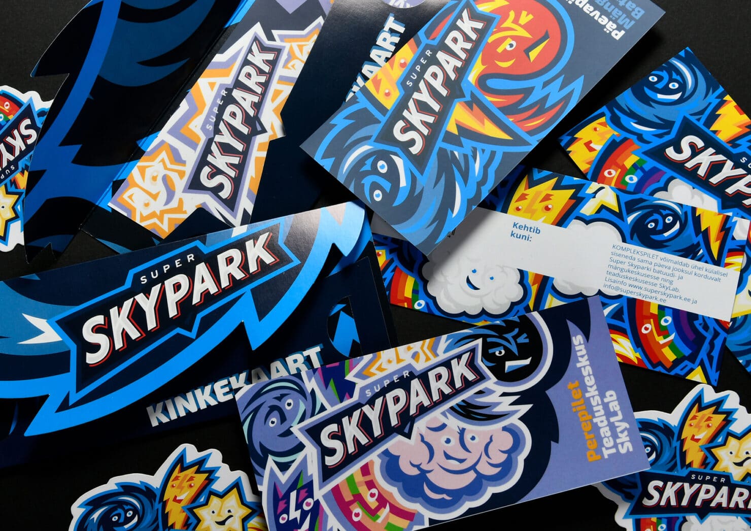
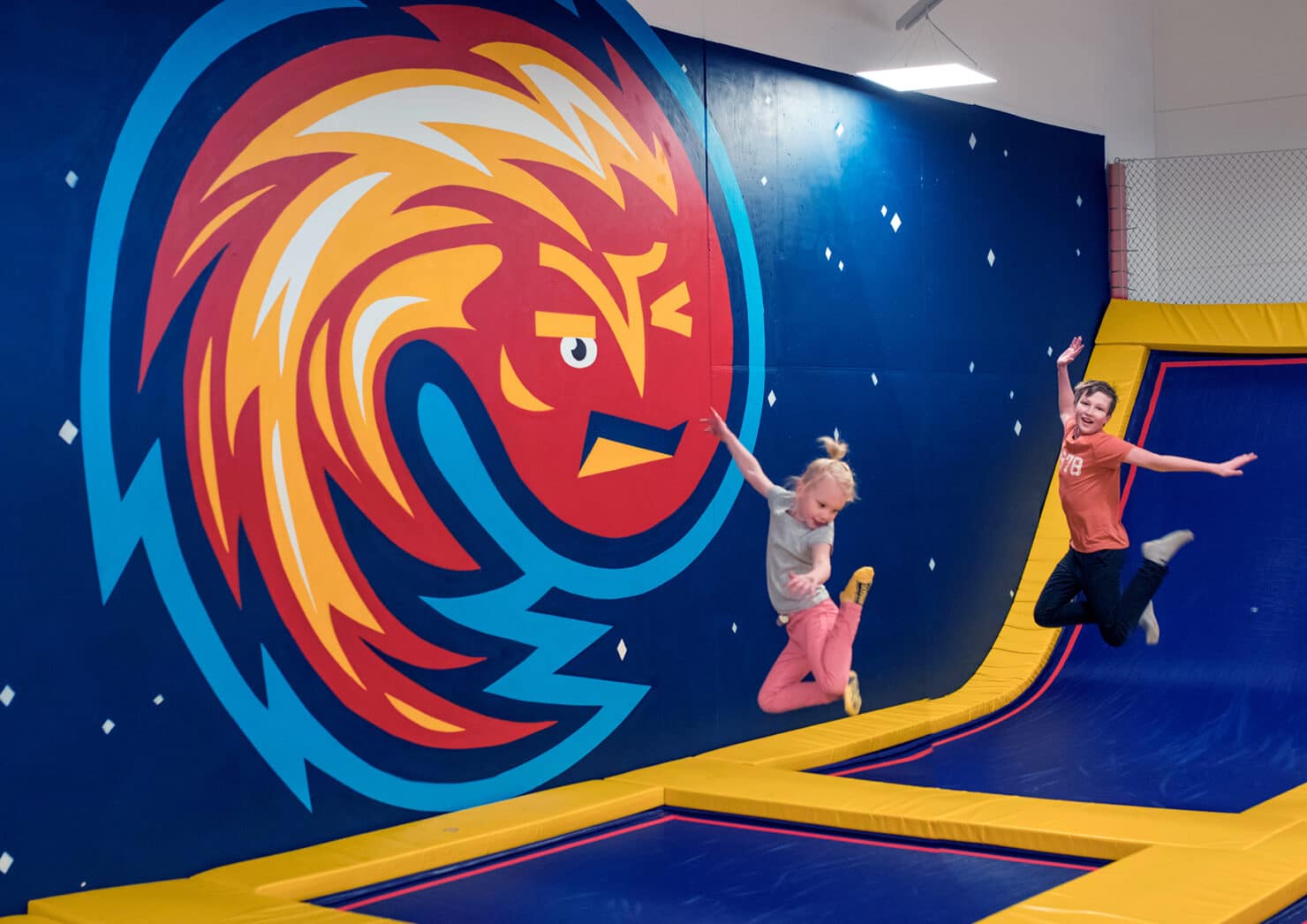
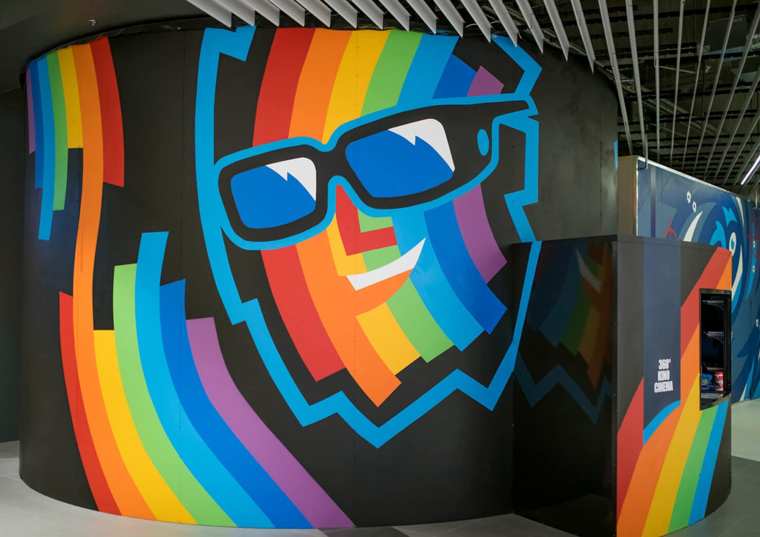
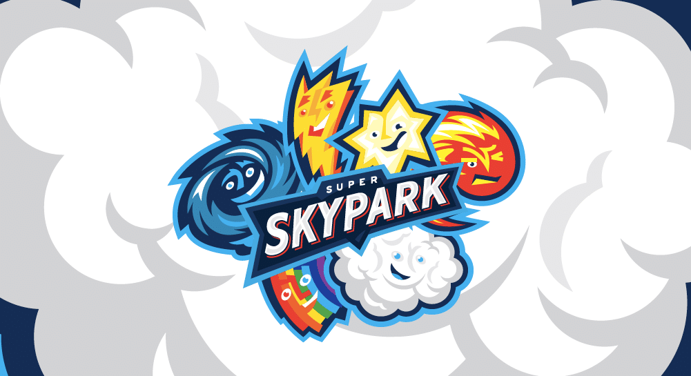
This led us to create the characters. If you had to make celestial phenomenon into heroes, which ones spring up in your mind? Clouds, the sun, rain? And??? See? Exactly. If you don’t want to mire yourself in clichés, you really shouldn’t shoot from the hip here. After a while our team of five assembled itself. Please allow us to introduce to you: Cometron, Stella, Claudz, Vortixy, Spectra. If you think we had to rack our brains to come up with the names – think again. The kids came once again to our aid. They told us what the characters are called, what their superpowers are and what their personalities are like.
Five-year-old and fifteen-year-old – how to appeal to both?
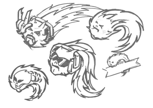
This is where the going got tough for a while. We let kids test our design, because at the end of the day whether or not Skypark succeeds or fails depends on them. A (momentary) setback hit us. The kids told us… that it’s for babies! After a brief pause we gathered ourselves, marked our foreheads with ash as a sign of repenting and set out to fix the situation. The designers remember this stage as “a rather frustrating one”. Meaner characters were created, new colour schemes were tested, as were other expressions and everything else we could think of. So many things were tested. A discussion over where the line between cute and mean runs arose. Andrus, the creative designer who joined the project midway, summarised the whole thing like this: “I’ve drawn eyebrows for so many weeks now, to get the expressions right, that I could easily find work at an exclusive eyebrow salon.” All’s well that ends well. A sixth character was born – Blitz, the alter ego of all pranksters – and less colourful, more alternative graphic design elements were used in those corners of Super Skypark where teenagers might venture.
Space as a superhero comic book
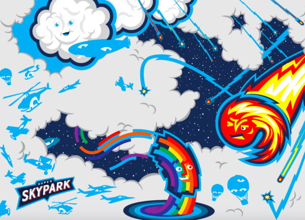
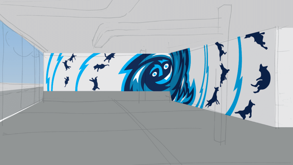
When we created the Super Skypark brand, we focused on the idea that one day the characters have to find their place in the entertainment centre, as wall murals. When we got to this stage we truly did deserve a pat on the shoulder – with the characters of Super Skypark we had created a world that could be expanded infinitely. Every character could tell their own stories and do their own deeds. The space functions as a comic book that has something to offer to everyone. The Super-graphics break into and out of the rooms. The smaller kids see the colourful characters, the bigger ones notice the more absurd elements, thanks to which the decorations aren’t perceived as childish. Everyone can finish telling their own story.
The space functions as a comic book that has something to offer to everyone. The Super-graphics break into and out of the rooms. The smaller kids see the colourful characters, the bigger ones notice the more absurd elements, thanks to which the decorations aren’t perceived as childish. Everyone can finish telling their own story.
Sketch 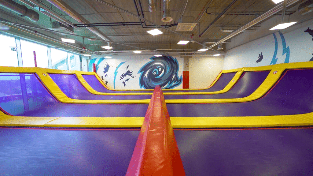
Real life
Super Skypark and breaking all visitation forecasts in less than a year
We’re happy that both kids and their parents have approved of our entertainment centre, which was built with love and care. Before the centre opened its doors, in autumn of 2018, Skypark forecast these visitor numbers: 2019 – 302 000 visitors (including 45 000 tourists), 2022 – 400 000 visitors, 2025 – up to 500 000 visitors. The coveted goal of half a million visitors was met already by September, 2019.
Thanks to this, Super Skypark became the most visited ticketed family tourism attraction as of September 2019. So, if your kid demands that their birthday be held at Super Skypark, do yourself a huge favour and start planning early, or you might just miss out.
Team
- Bert Nool – Creative Director
- Kaarel Vahtramäe – Designer
- Andrus Lember – Creative Director
- Siim Tikk – Designer
- Pärtel Vurma – Project Lead
- Kadri Pukk – Project Lead
- Joel Kotsjuba – Service Designer
Partners
- Taevapark – The Client
Awards
- ADC*Estonia – Wayfinding Design (Silver)
