2023 | SalamandraGraphicDigitalStrategicWebsiteBrandingTypographyUser Research
Salamandra – generous expressions from a structured world
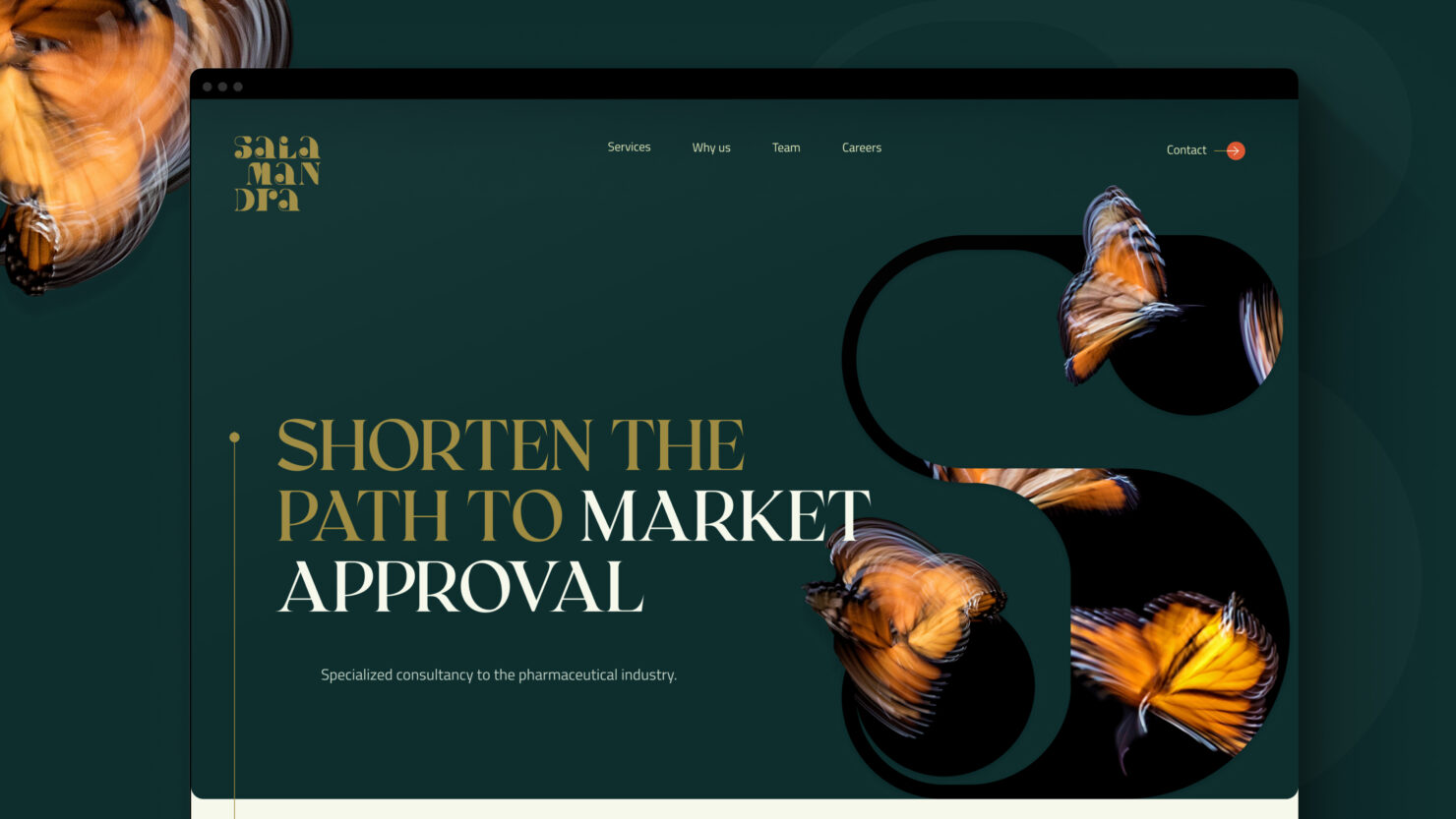
Salamandra consultancy helps clients navigate a highly regulated pharmaceutical industry
Salamandra possessed all the essence – a passionate team, passionate founders, passionate future, yet incompatibly unexpressive representation. Working together with their international team, we embarked on a journey to create the brand tools and guidelines that would reflect truly reflect them, their people with science at heart.
Connecting the dots
Working with a global team in a highly particular field, it was clear we need to start by creating understading. In addition to desktop research we concluded:
- 16 interviews
- 4 workshops
- 1 client survey
Over the course of research we got to know them well and applied the insights strategically into a thorough and polished brand platform, that was followed by visual tools to match.
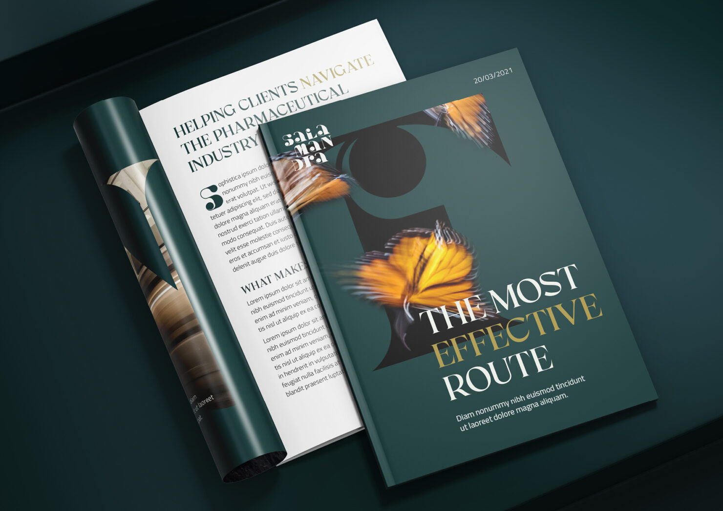
The branding turned out unique, just like Salamandra is. It was made to stand out in the usually unexpressive field. They work hard and strategically while celebrating the creativity of the experts in their team. Salamandra brand expresses intelligence, sophistication and has a strong boutique feel.
In addition to passion and commitment, they embrace uniqueness and personality
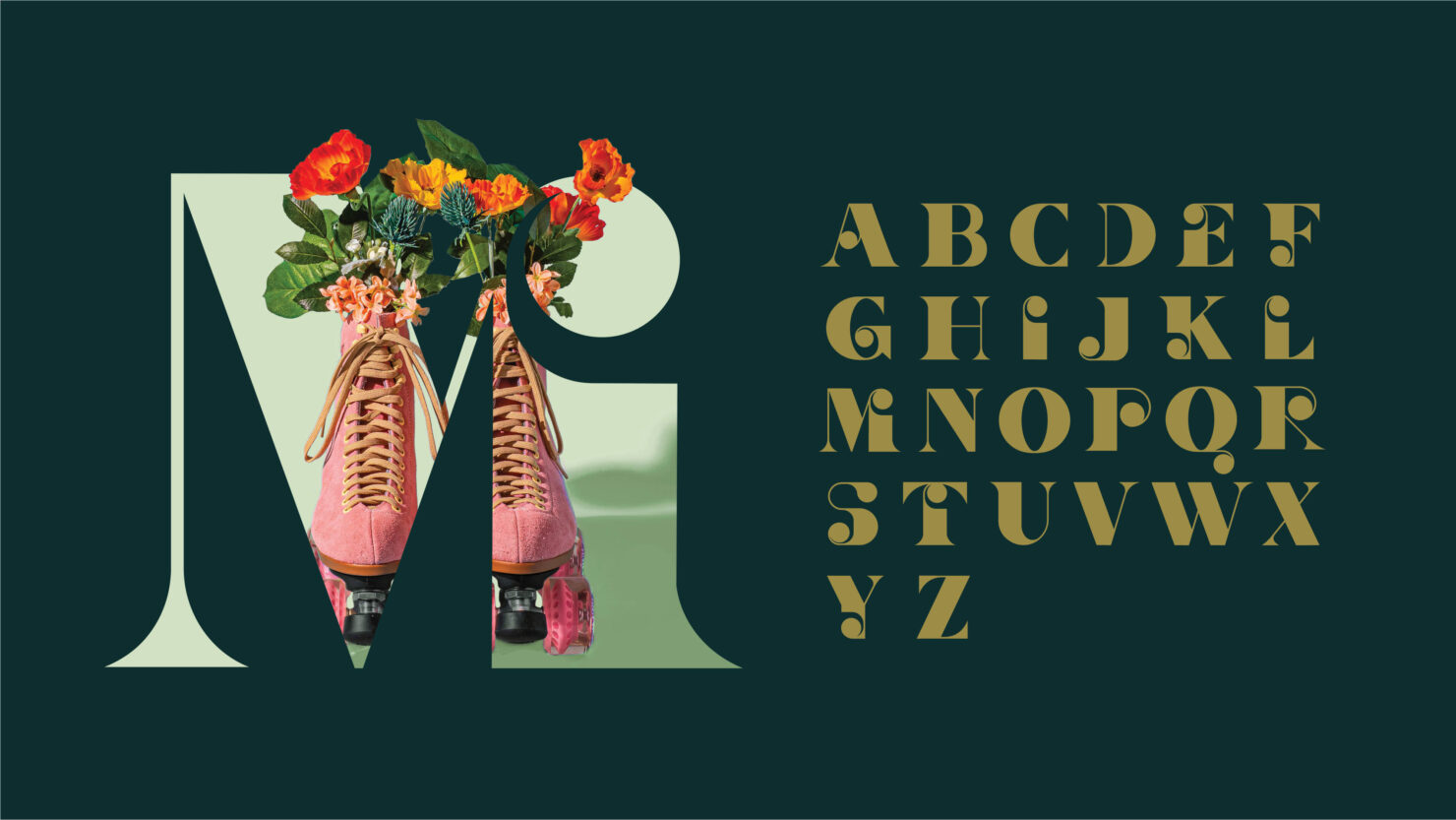
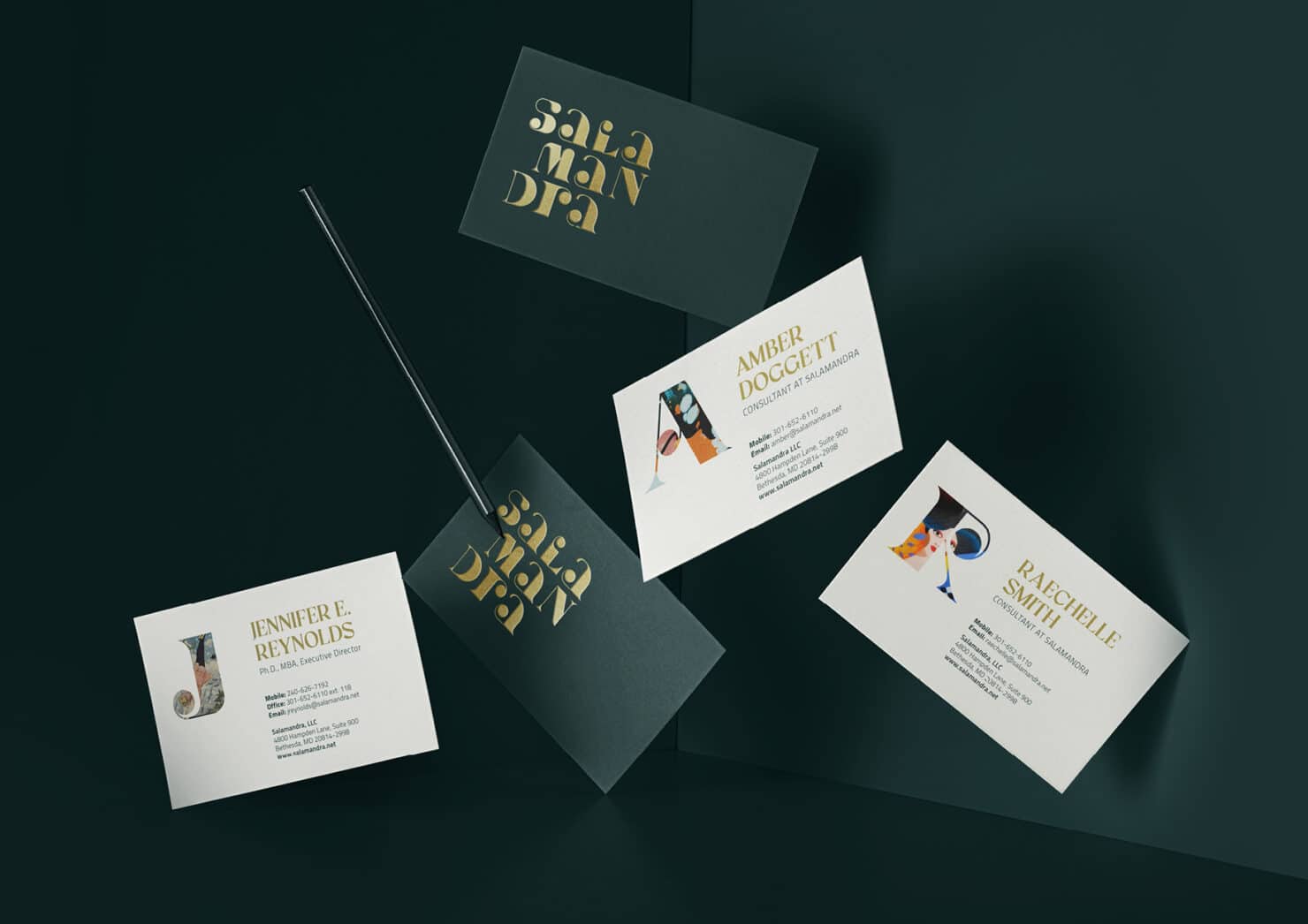
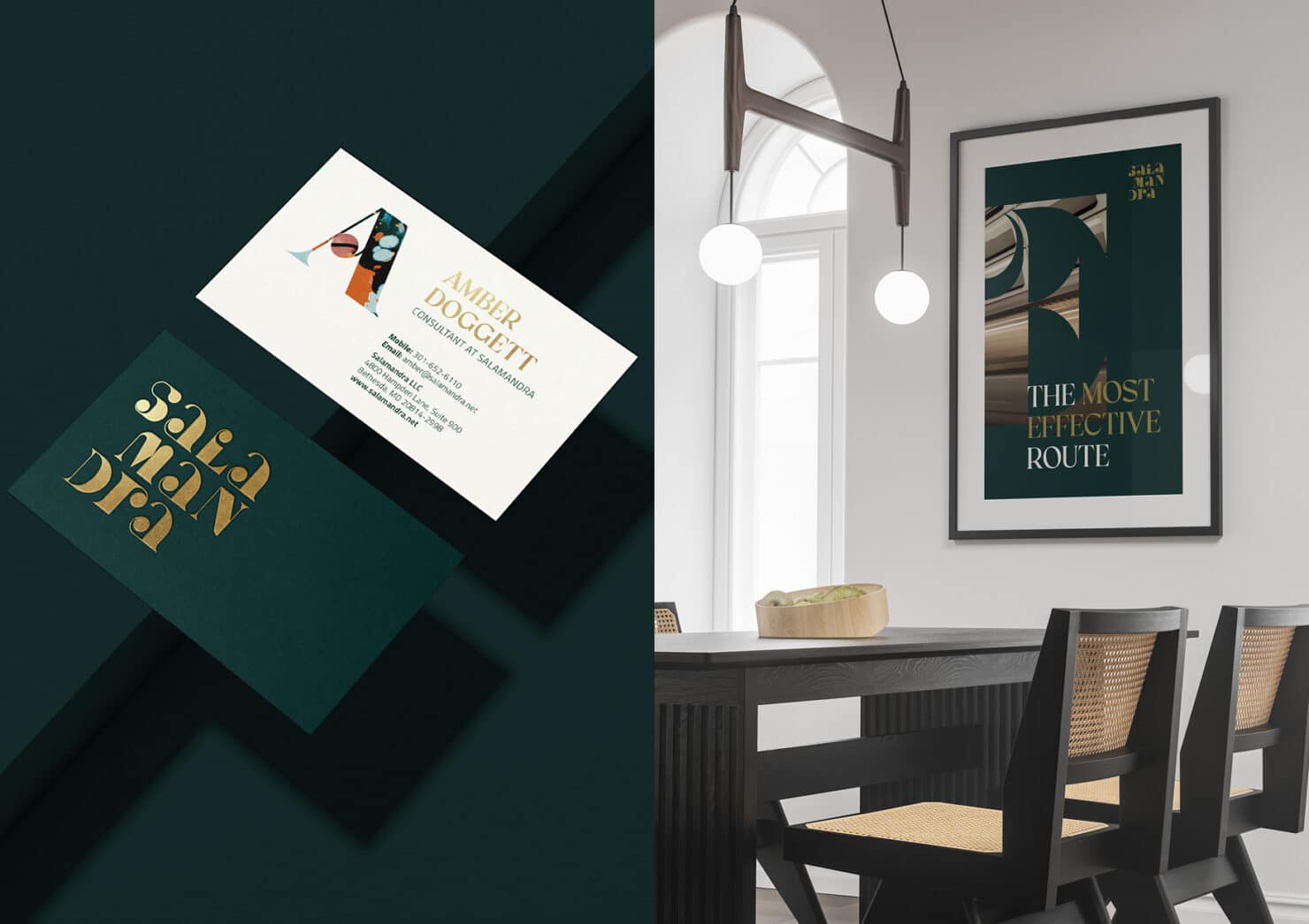
The logo for is a depiction of their technical expertise to connect the dots with a tailored approach. The circles in the typography draw from scientific data points they rely on in their work, while the elegant feel of the lettering ties the concept together representing the custom solutions that are the result of their impeccable quality standards.
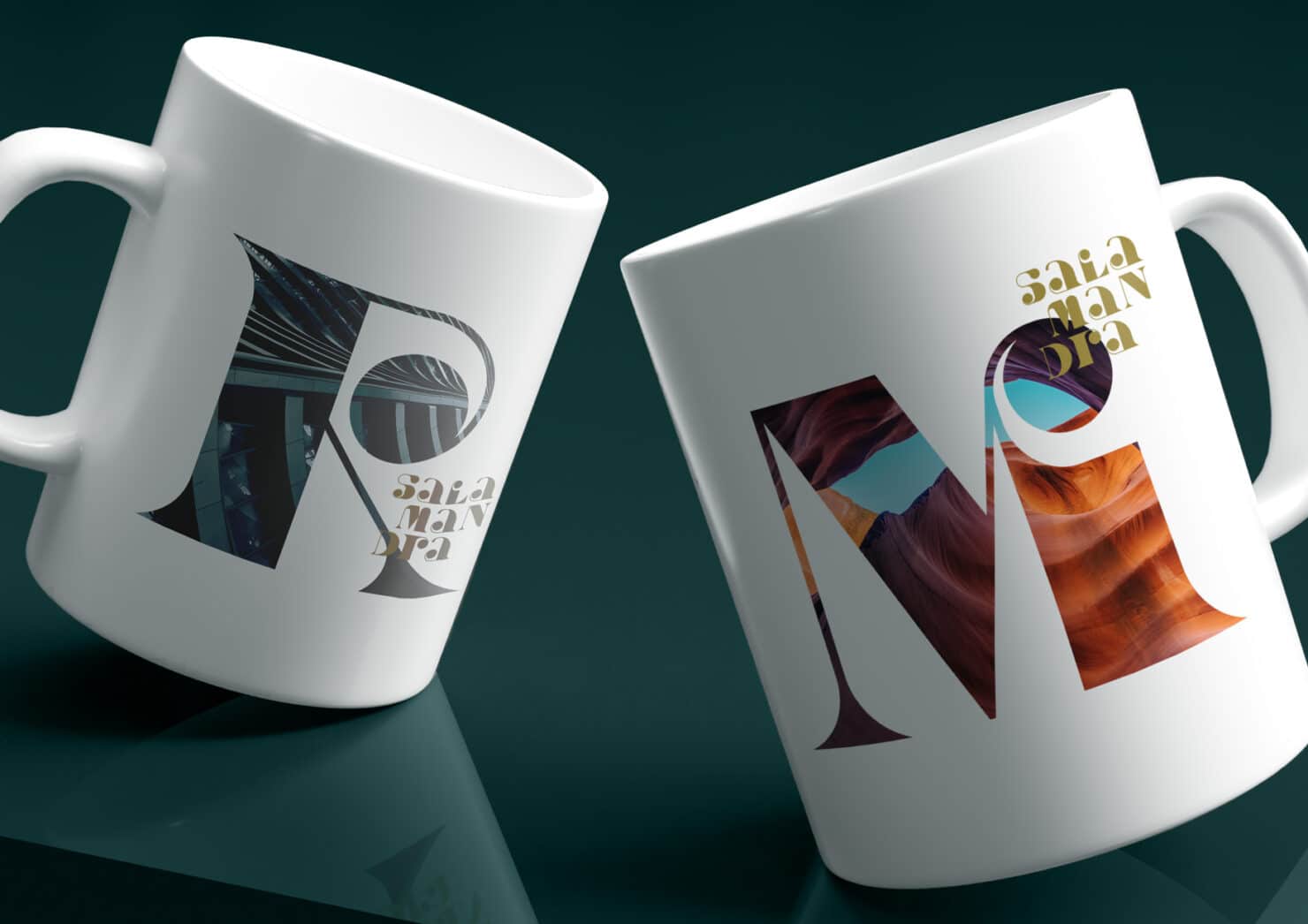
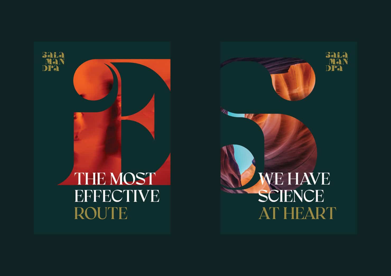
The custom lettering is a testament to that, playing an important role in the toolbox that lets each and every person in Salamandra express their character, whilst staying true to the brand.
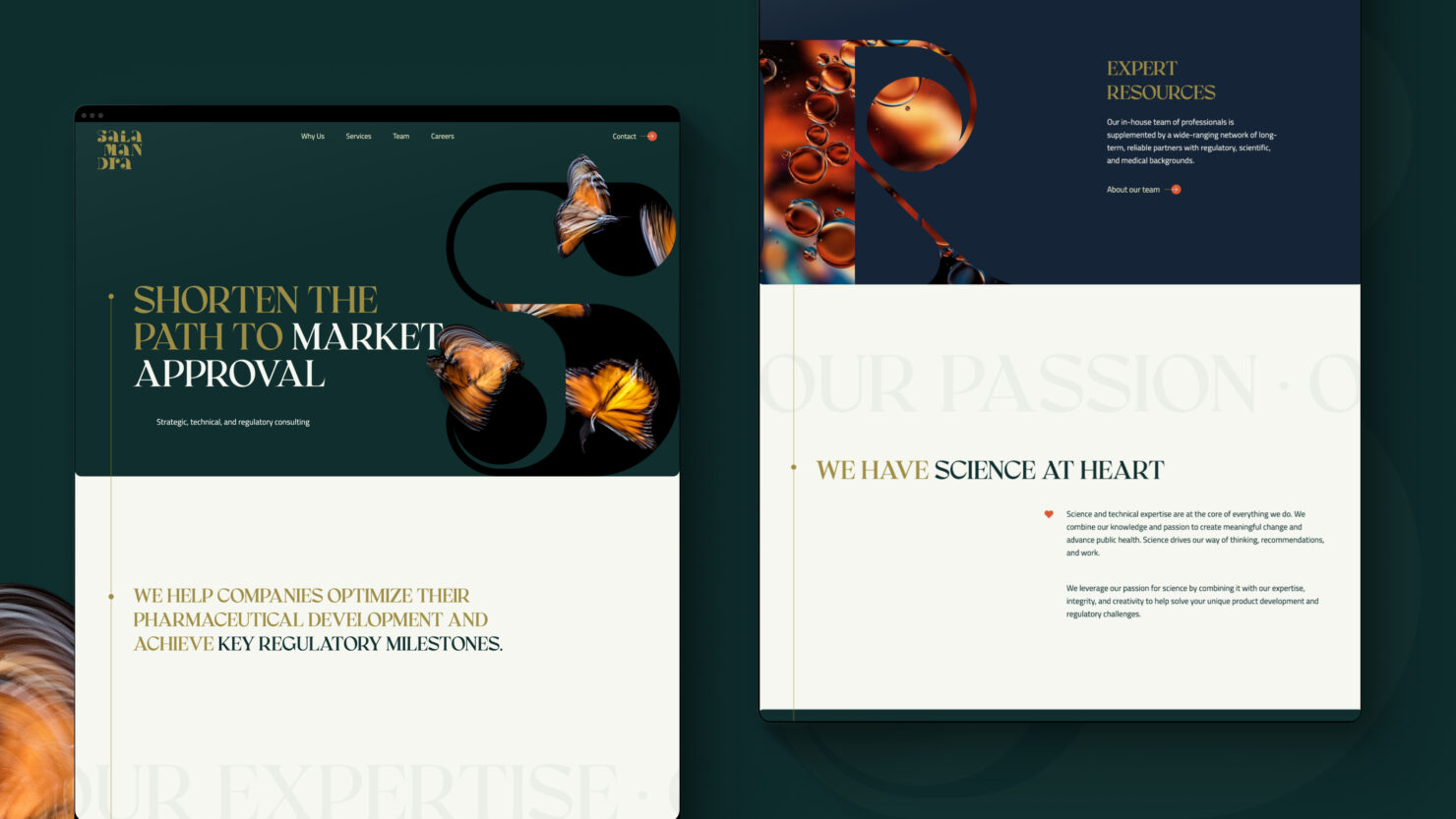
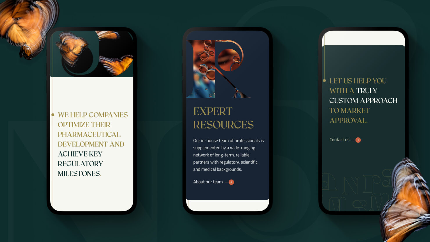
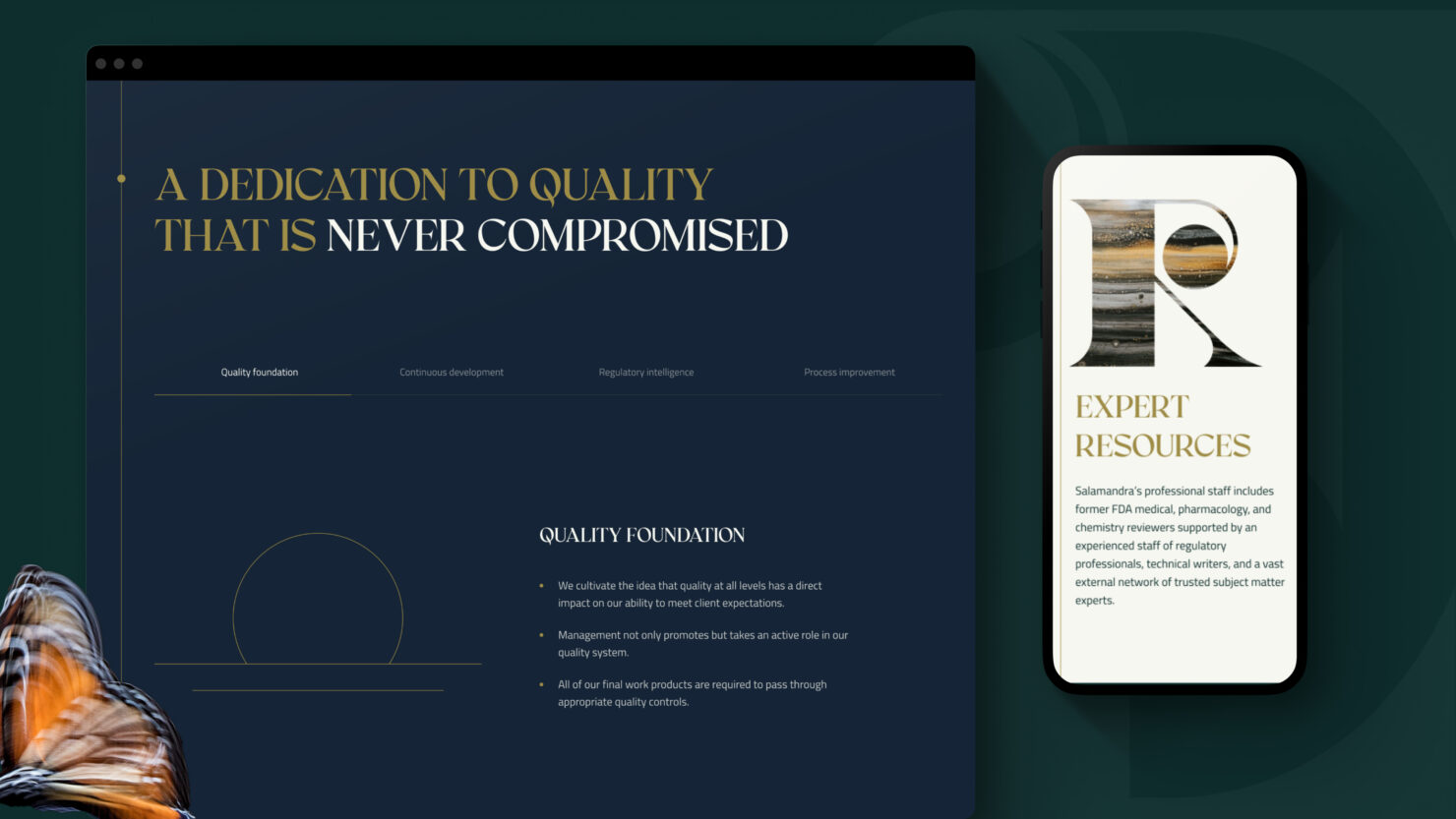
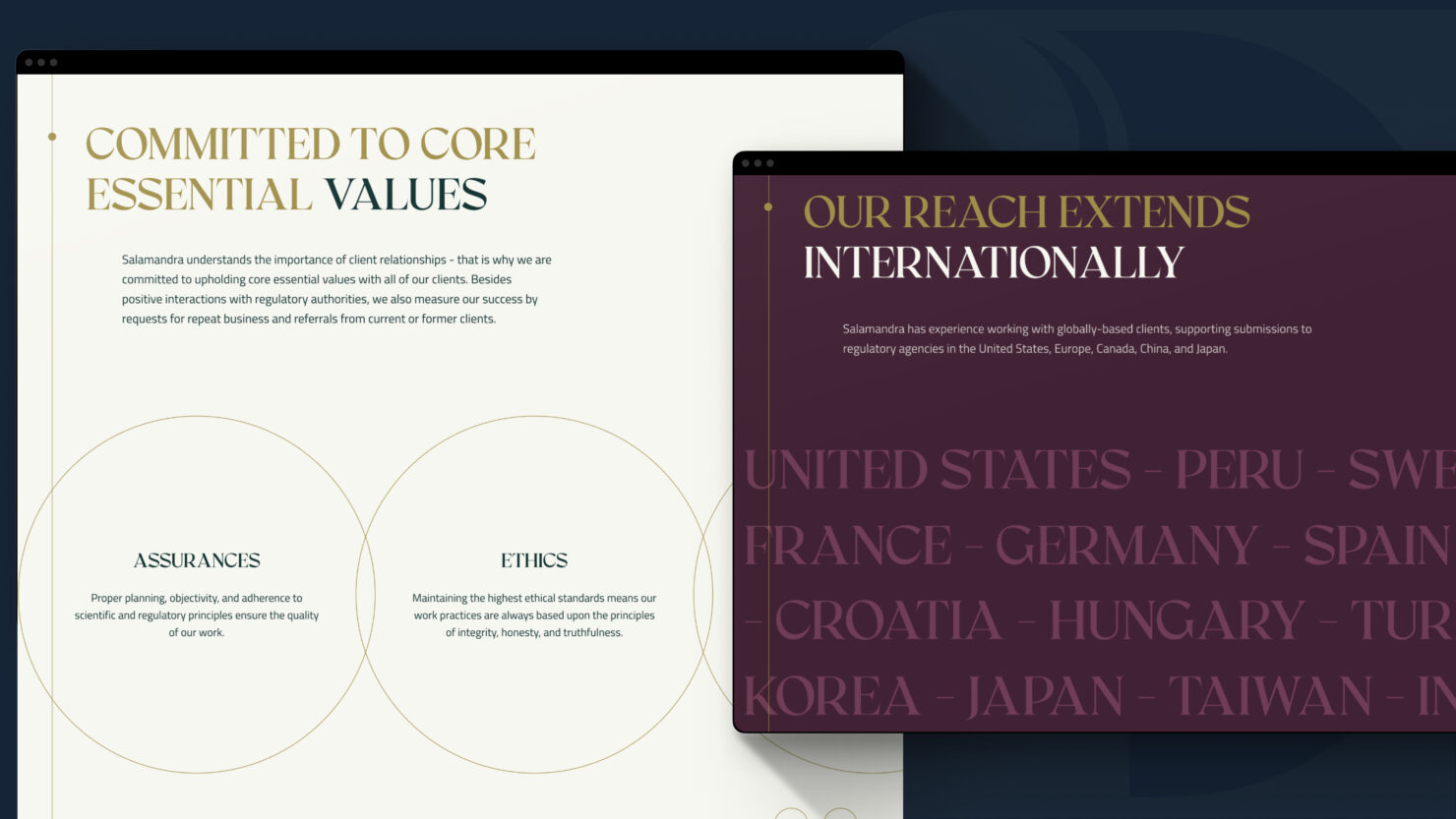
The new website of Salamandra complements the company’s new brand and elegantly stands out from the crowd, appealing to potential customers and employees.
Work began with a review of the existing website content and structure, which was largely retained but simplified. The main challenge which emerged was to create a diverse and interesting user experience while presenting technical and information-dense services and competencies that offer a relatively limited visual palette.
In a highly collaborative and iterative process each page’s content and visual elements were carefully composed. Customer journeys were thoroughly considered navigating both vertically and horizontally through and between pages to give a rich and varied experience.
Additional accent colours and restrained visual elements were added, while the client was meticulous in advocating for their end user and making sure the result was a true reflection of themselves. The final outcome presents Salamandra in a rich and multi-layered way. The user’s curiosity is piqued and without being overly onerous, the full depth of Salamandra and its people is revealed.
> Visit website
Team
- Nele Volbrück – Project lead (brand)
- Joseph Sturm – Project lead (digital)
- Piia Tammelo – Creative lead
- Keiu Grossberg – Art director
- Grete Hints – UX / UI designer
- Vahur Vogt – Developer
- Sofía Vega Anza – Strategic designer
Partners
- Kristina Lupp – Copywriter
- Salamandra (Karin Kook, Richard Krasnow, Jennifer Reynolds, Stephan Vegliante, Kaylee White, Crystal Murray) – Client
Awards
- Kuldmuna – Typography (Shortlisted)
- Kuldmuna – Homepage (Shortlisted)