2022 | PiletileviPiletilevi Group ASGraphicDigitalUser InterfaceBranding
Piletilevi – next gear for a well oiled machine
Piletilevi is the renowned and top of mind service provider in the business of ticket sales that needs no further introduction. 25 years of experience and more than 6,5 million tickets sold annually solidifies their status as the leader in local and neighbouring markets. They have always kind of been there, like an everlasting pillar, untouched by time. Let’s be real, that is only one side of story, though.
Be the change
As times change, people, companies and brands evolve. Over the years, Piletilevi Group’s previous brand fell short to reflect their ambition, strengths and inventive spirit. It also lacked tools for building a design system in order to provide the user friendly solutions they are capable and eager to offer, in the digital world as well.
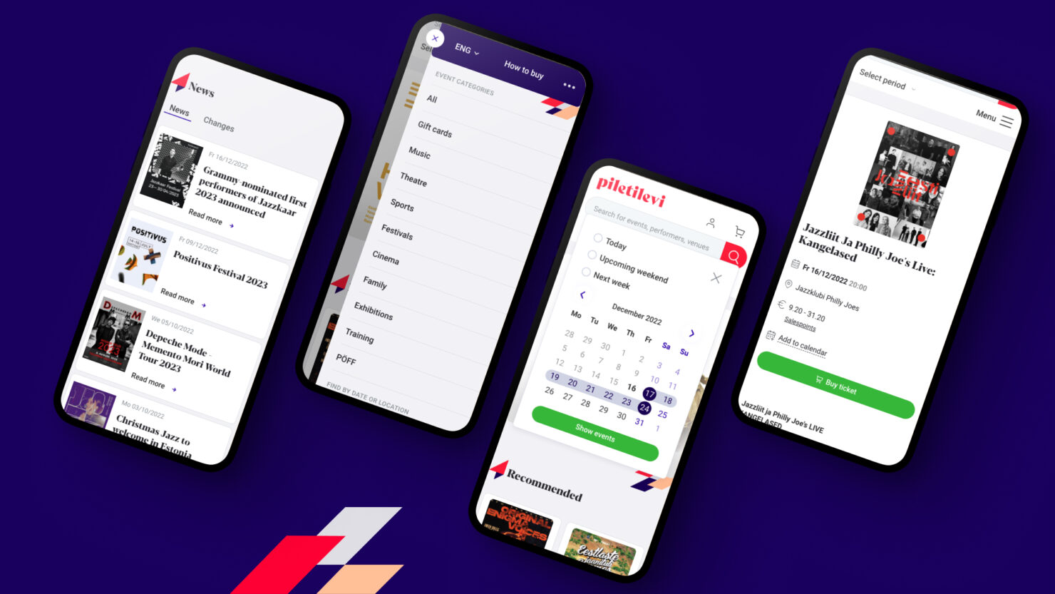
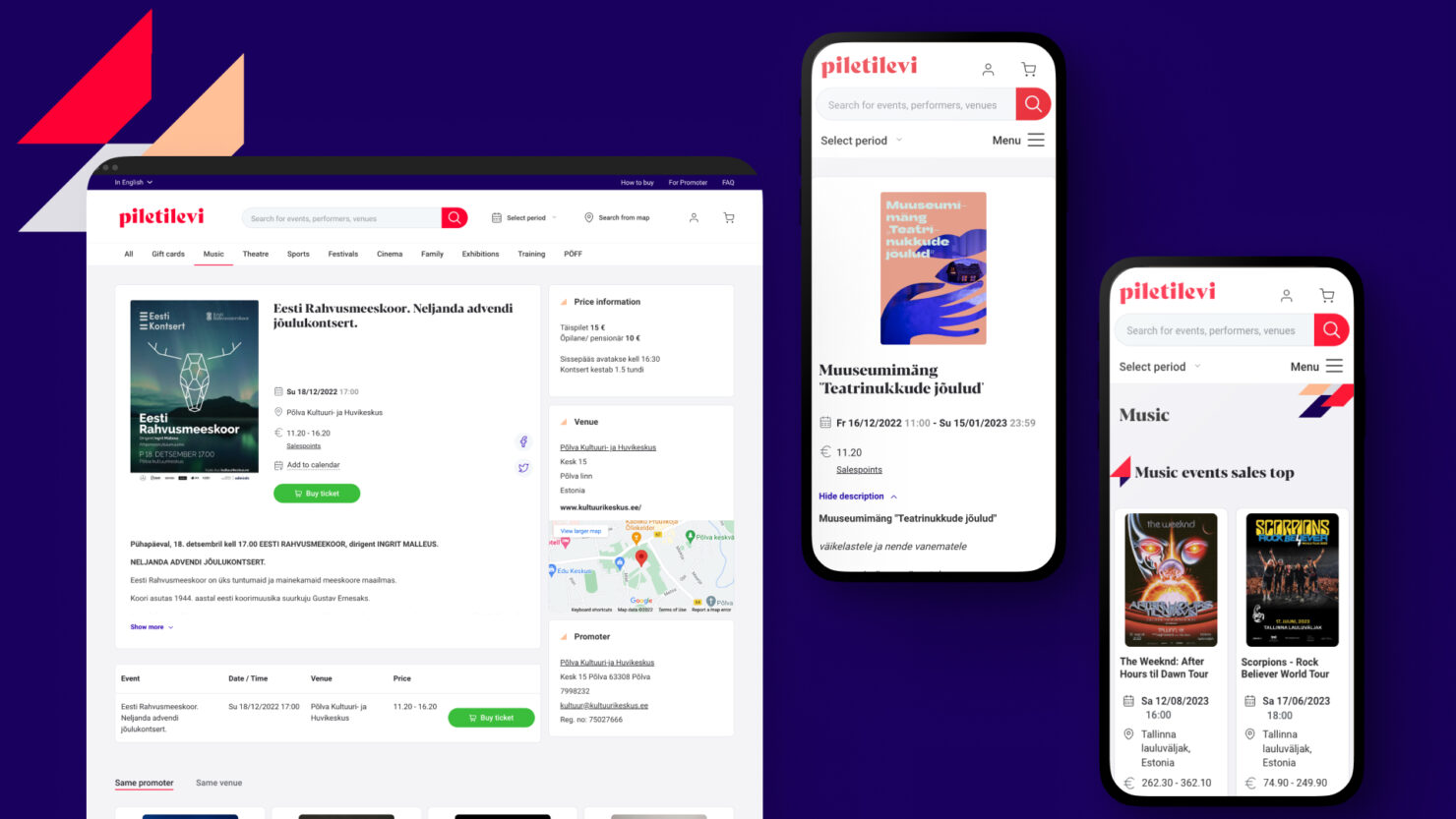
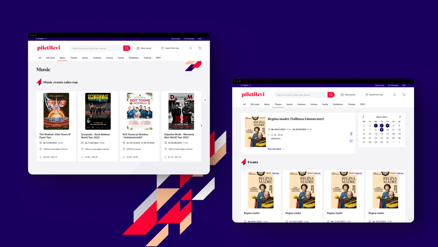
We were tasked to revamp their brand and visual identity and renew the UI/UX for customer-facing products, so they would continue to stand on classic values such as professionalism and reliability, but be nimble and dynamic in its form and spirit to stand the test of time.
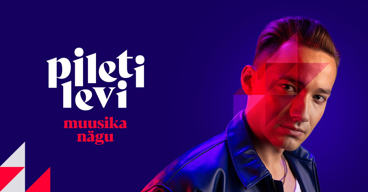
Familiar building blocks, fresh construction
Following a logic tried and tested, our team dove into Piletilevi’s world. With help of workshops and qualitative interviews with members from their international teams, different countries & cultures, as well as validation sessions with separate segments, we sifted through the essence of Piletilevi over time and ignited a shift in the way the organisation makes sense of its activities.
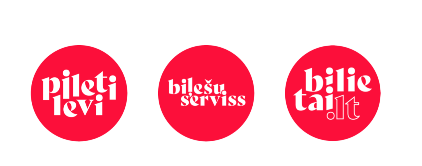
Adjusting focus points and making use of years of experience and data, we determined that Piletilevi brings different parties together and serves as a plaform of growth for artists, partner & toolbox for promoters and marketplace for the audiences.
To support the change and bring it to life, we created the tools in form of a design system that covers strategy, brand, content design & digital outputs.
As a remarkable addition, a self-service portal for the promoters and organisers was built by Helmes, based on the new strategy & brand.
Championing vigour
As for the visual identity, Piletilevi captures
- Breaking out of the bubble & experiencing life LIVE!
- Upward mobility, movement, active look on life
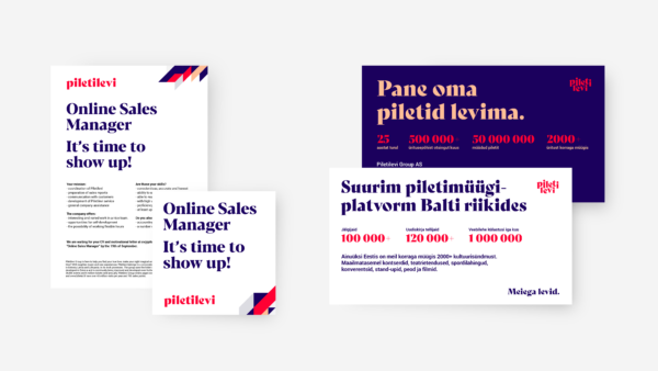
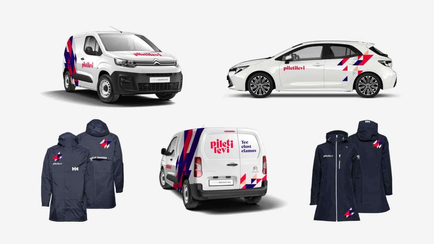
That liveliness comes through in designs. The graphic element is inspired by the famous alienlike zigzag of Ziggy Stardust. The dynamic element offers diverse usage in print & digital environments. Mind you, there are distinctive color schemes for customer and organiser facing materials. Red and blue respectively.
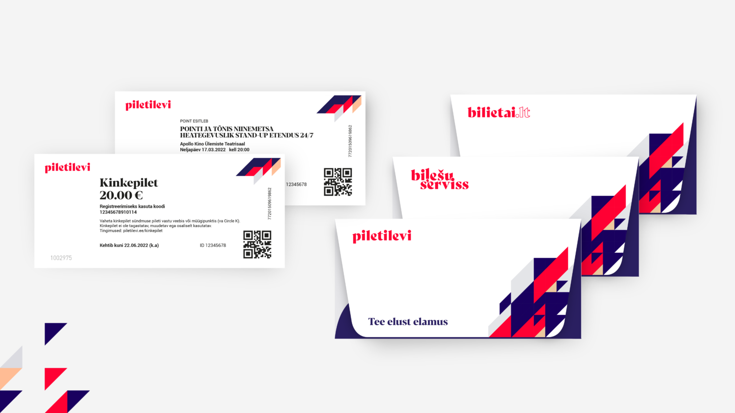
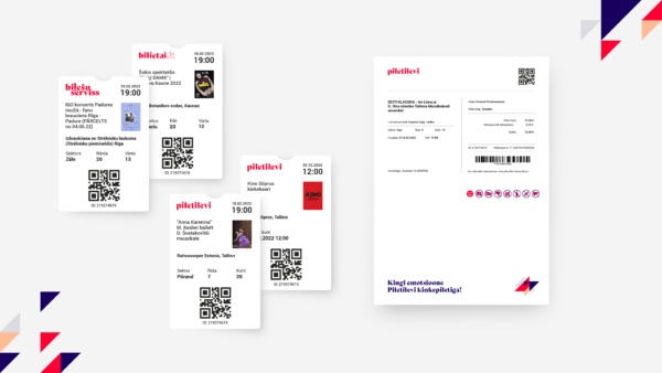
How it started, how it’s going
From the inside of a successful and constantly growing company with an unconventionally broad business model with ever-improving results, everything seemed logical and functional. In reality, however, the joint change process helped not only to reorganise, but to explain the company’s operation to the employees of Piletilevi Group, which has recently grown in volume, and our foreign subsidiaries. Each company radiates the energy coming from within and it feels like we got this powerful ball rolling.
Jaanus Beilmann, Piletilevi
Since the project launched, Piletilevi has detected:
- Increase in customer satisfaction & return of customers
- Increase in satisfaction of foreign customers regarding the brand and service innovation of their subsidiaries
- The complex of changes has helped Piletilevi Group to easily guide new markets, via acquired enterprises to smoothly use their software platform
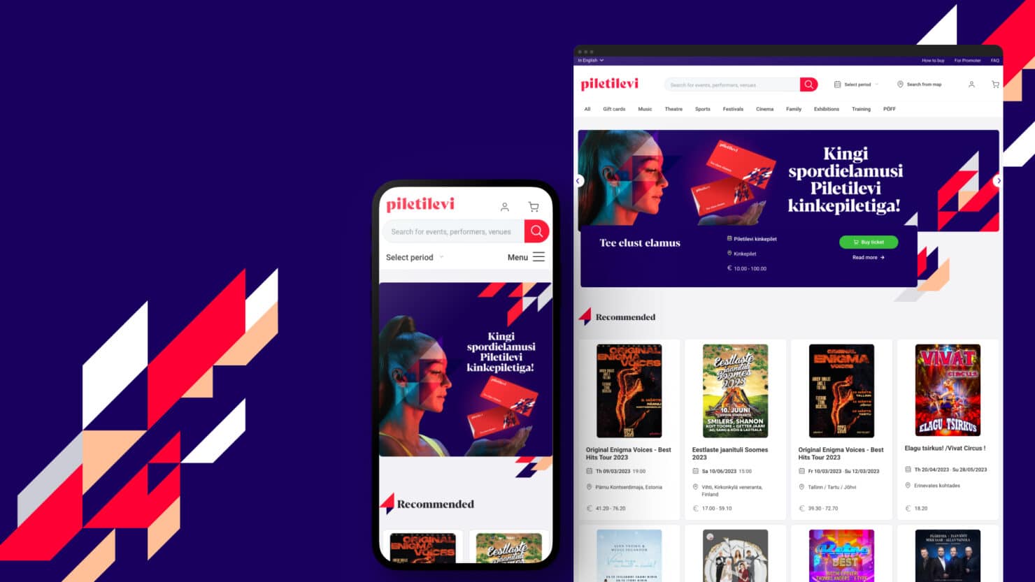
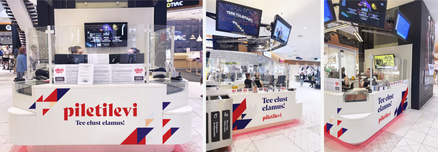
Following a swift branding update for the website, redesigning their digital platforms in full is in progress and the brand is soon to be visible in Piletilevi’s offices, too. Stay tuned!
Team
- Janno Siimar – Creative Lead
- Magnus Haravee – Art Director
- Gunnar Hunt – Copywriter
- Maris Teder – Brand Producer
- Kristo Pajus – Digital Producer
- Grete Hints – Digital Designer
Partners
- Piletilevi (Sven Nuutmann, Jaanus Beilmann, Merilyn Räbbin, Ilja Judeikin, Andreas Kirss, Mart Eensalu) – Client's team
- Helmes (Rait Matiisen, Chris Kokka, Riina Libe, Mikk Tasa) – Promoter's self service portal