2023 | Selver ASGraphicEnvironmentalRetailWayfindingBranding
Delice – la dolce vita in a grocery store
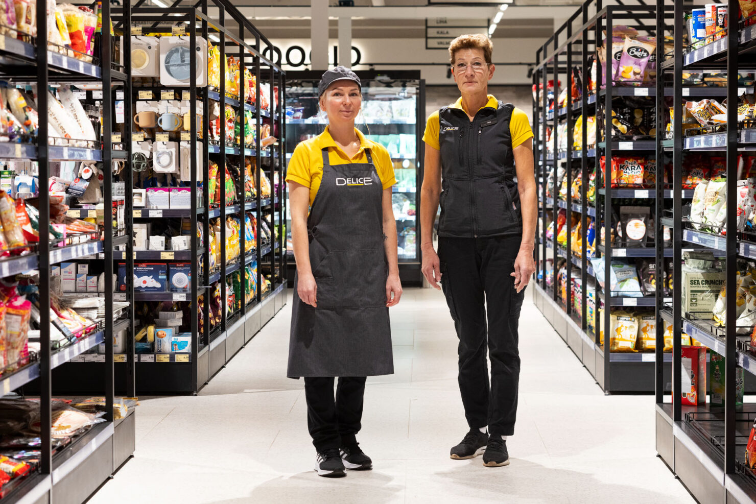
Delicacy, delicatessen, Delice – a store that aspires to be the grocery store of choice for those seeking quality tastes, a diverse selection, and a pleasant environment.
After undergoing a significant refreshment and reevaluation of its entire identity and goals, our task was to breathe life into Delice’s new identity through visual graphics and environmental solutions.

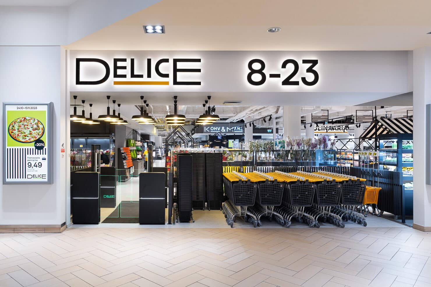
Concept is a story, a world in itself
Delice’s store is a living proof that a vibrant space manages to awaken the senses. It’s a delightfully classic shopping experience where curiosity is piqued by the overflowing culinary displays or tempting aromas from the bakery ovens.
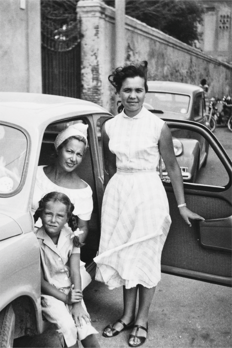
We drew inspiration from places where people seem to just know how to savour the moment and take it easy. Places where it’s intriguing to explore, igniting imagination and arousing the desire to experience unique flavors. A mediterranean marketplace is just a place like that.
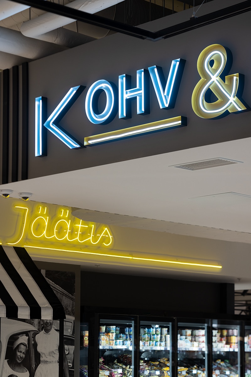
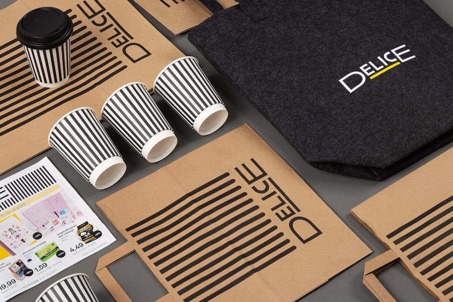
Expressive brand on a public space canvas
The key is to put the idea to work functionally and within the space. On the one hand, there was a need to bring personality to the environment, to tell a story, and to provide the room with distinctive elements that lift it out of the ordinary. On the other hand, we must not forget that public space must be logical and accessible for a large crowd. It should not be burdensome or sacrifice common sense for the sake of entertainment. This applies both to the tangible environment and digital or printed media.
Bringing the idea alive in the interior
Simplicity and effectiveness go hand in hand. The striking bright yellow is balanced by black and white, a playfully retro pattern. This is reflected in the typography – a clear, sans-serif font with a slight twist.
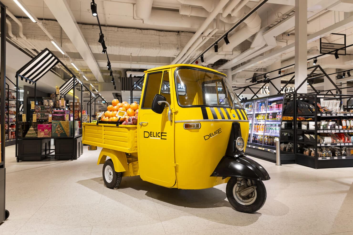
Character is infused through elements like the yellow tuk-tuk transformed into a fruit stand and era-defining photos adorning the culinary displays. These elements encapsulate the energy, mischief, and pleasures of la dolce vita.
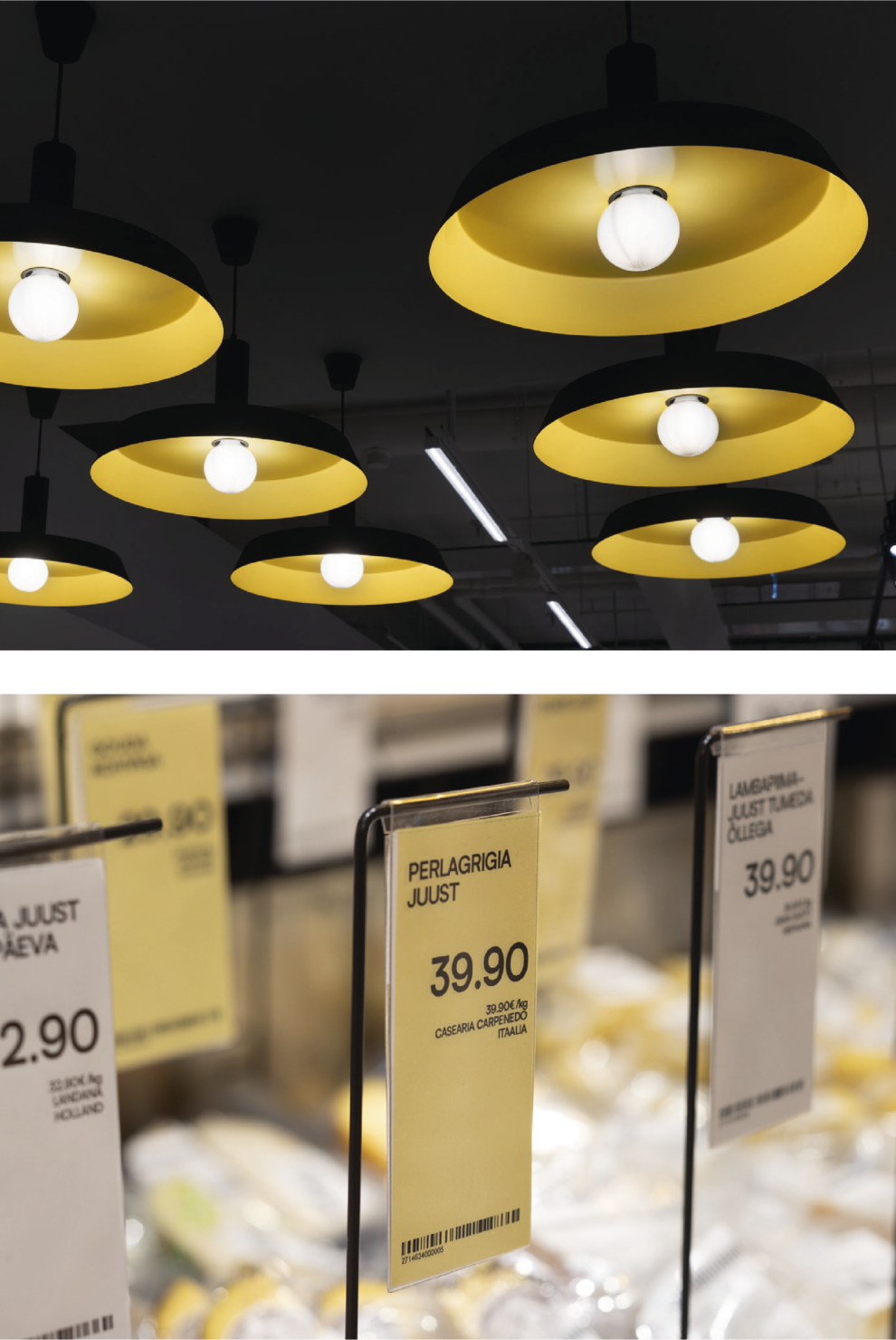
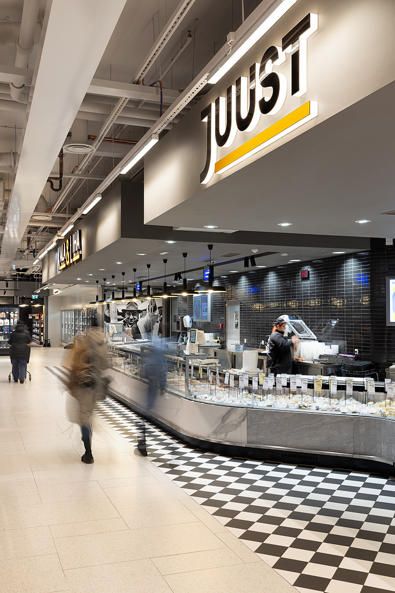
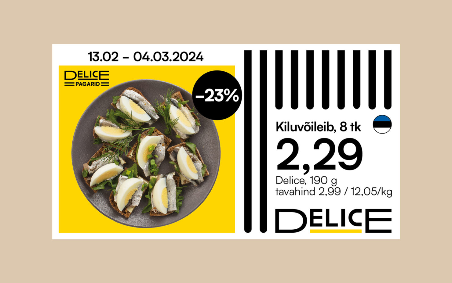
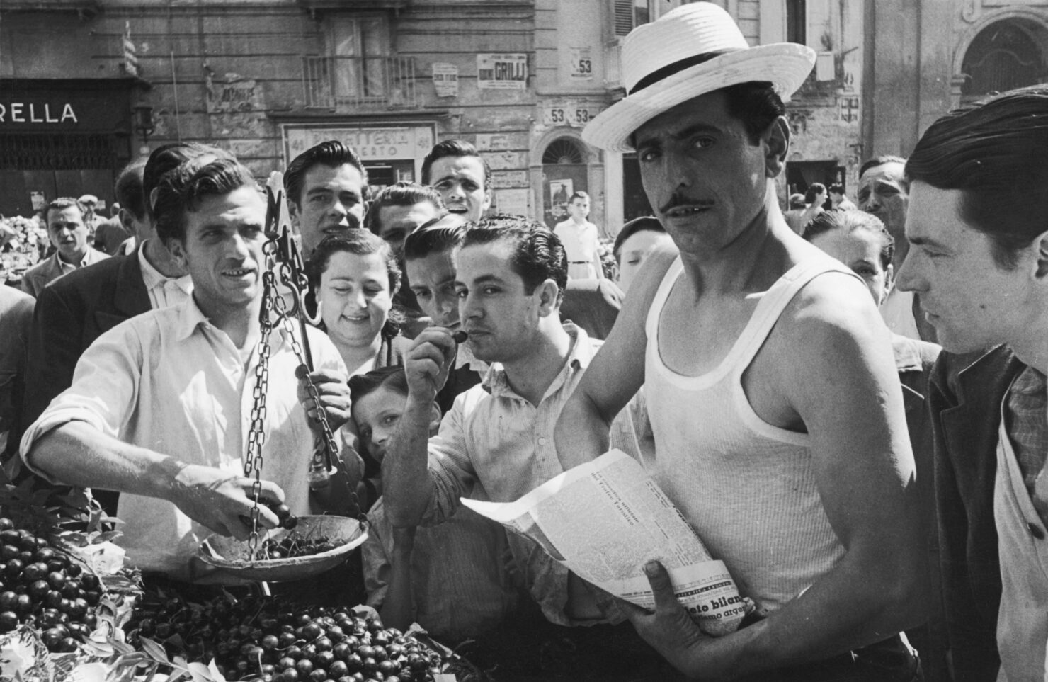
Grocery shopping doesn’t have to be an overwhelmingly tedious obligation. Go see for yourself!
Team
- Kristian Kirsfeldt – Creative Lead
- Elin-Harriet Helemäe – Wayfinding Designer
- Jaak Peep – Designer
- Kevin Laus – Product Designer
- Mikk Matsi – Head Engineer
- Helen Küppas – Producer
- Kadri Pukk – Producer
- Mart Lankots – Account Manager
Partners
- Vaikla Design (Argo Vaikla, Katrin Vaikla, Kristoffer Vaikla) – Interior Architects
- Tiina-Mai Nummert – 3D visualisator
- Artelli Auto – Vehicle restorator
- Media Element, Deviis, Digitrükk – Production
- Delice (Andreas Leimann, Kristi Lomp, Agi Metsandi, Triin Kaare, Illi Ojavere, Merle Salu, Aare Maidla, Heili Mekk, Rivo Veski, Anneli Kruus, Iris Sert, Marju Mikli, Kadri Madison, Tarvo Tangsoo) – Client Team
- XOfoto (Oleg Hartšenko) – Photographer