2020 | Apotheka BeautyGraphicEnvironmentalInterior GraphicsRetailWayfindingBranding
Apotheka Beauty branding and retail solutions
a brand for smart and beautiful women
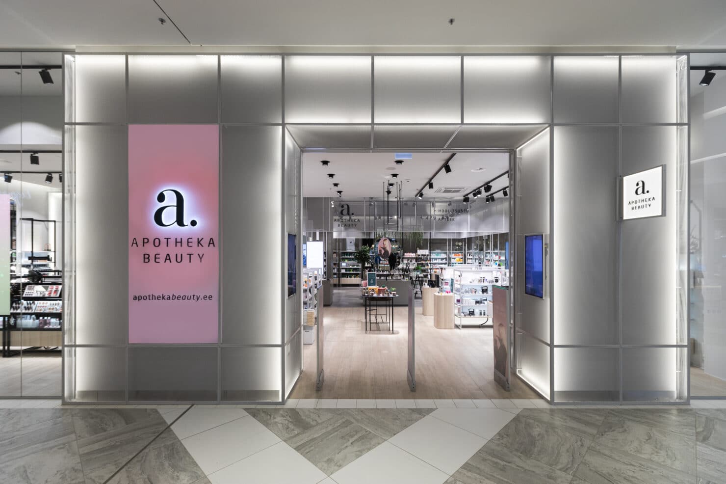
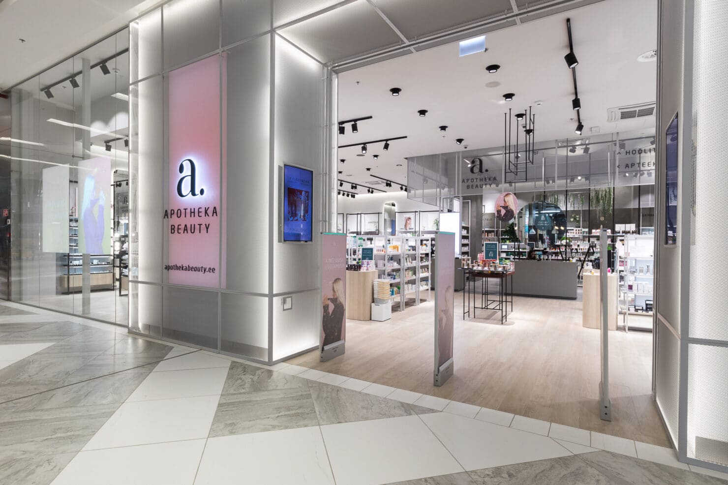
When Apotheka first told us that they have a plan to create a whole store only for pharmaceutical skincare products, we recognised straight away what a bold idea it was. They had realised an actual market opportunity and needed to act quick in order to be the first.
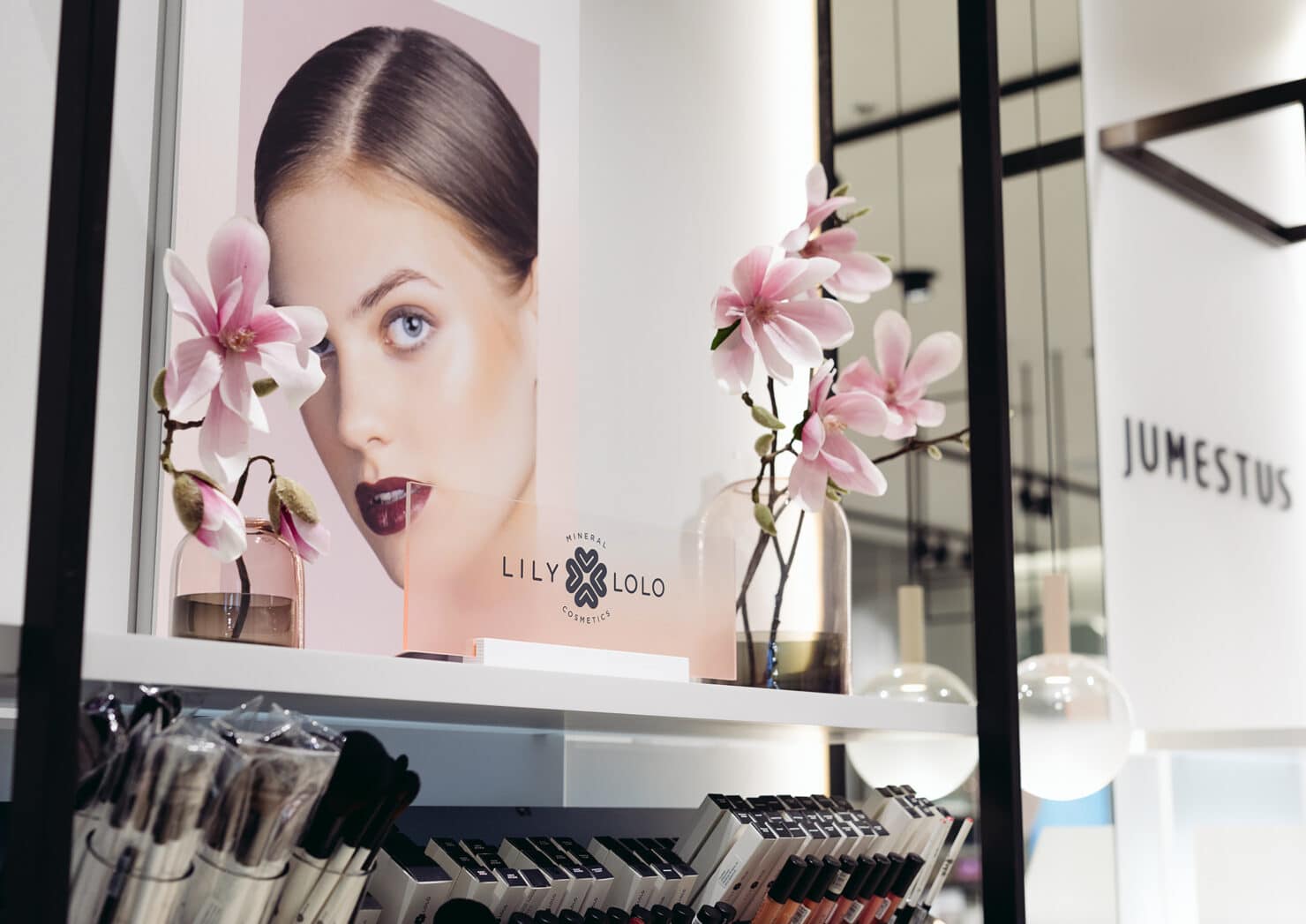
Young and knowledgable women, who care about the environmental impact of their lifestyle, quality of their food, clothes and beauty products.
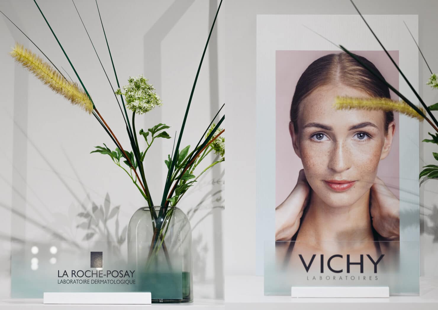
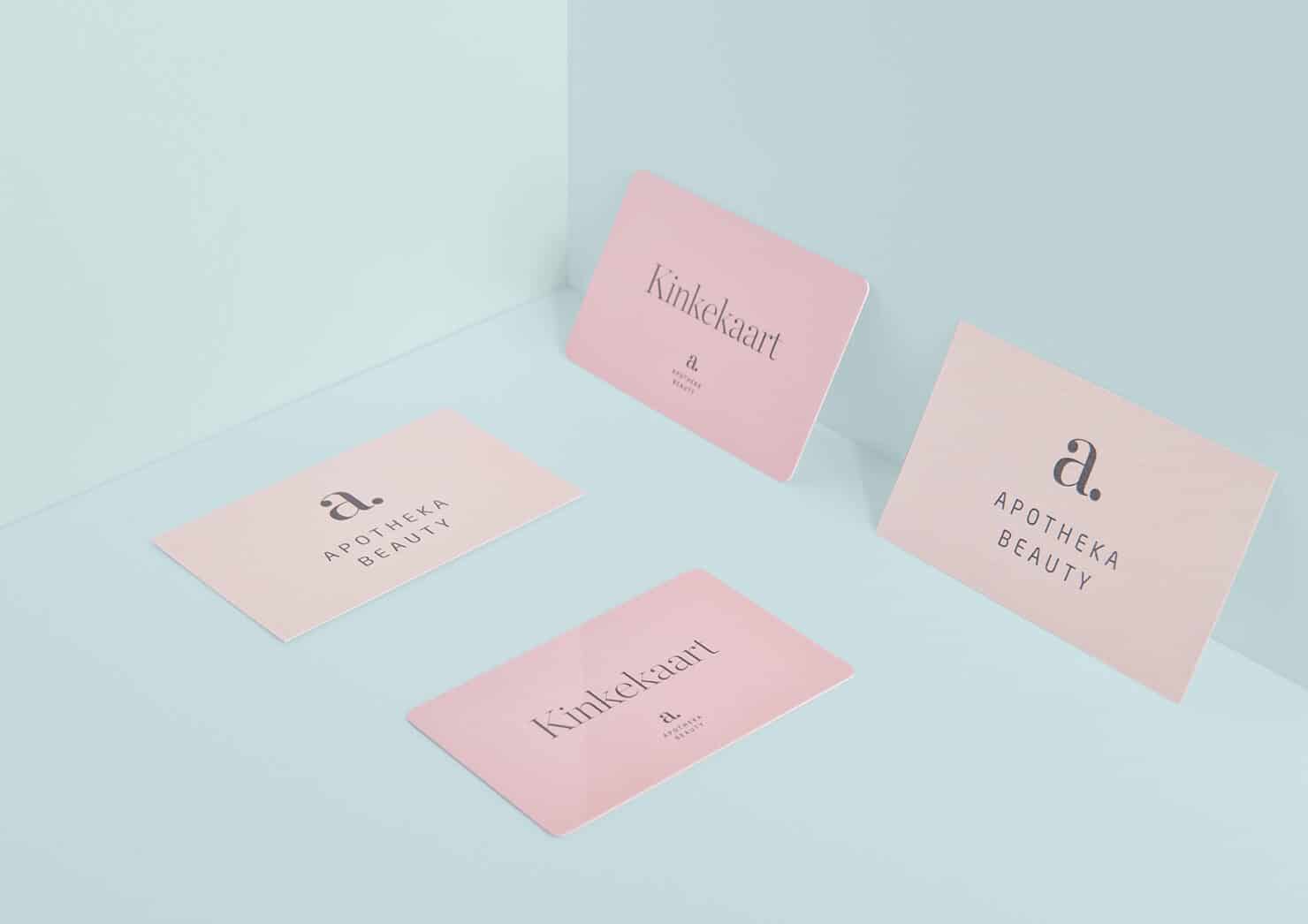
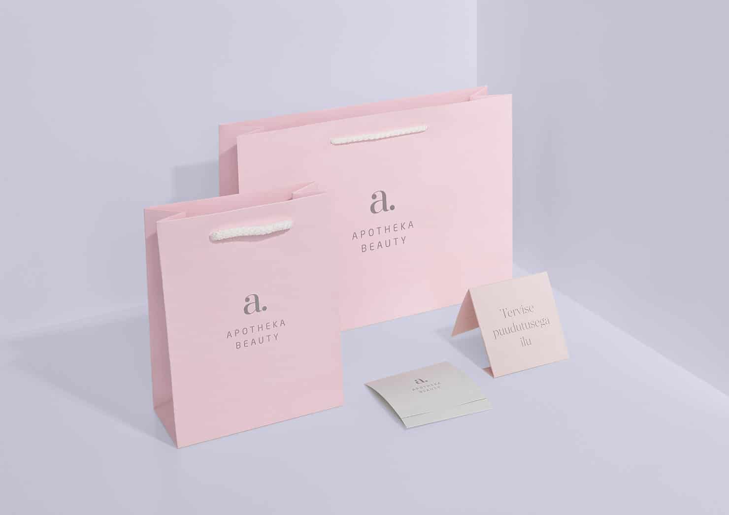
So we had our work cut out for us. Our main objective was to design a brand that is more gentle, light and and carries a caring tone of voice, but still has a strong connection to its main brand – Apotheka. In order to accomplish that, we used colours that are present on a fresh summer morning. The purity of these first hours, when the sun is rising and the whole world is still asleep.
It’s the moment that stays between you and nature.
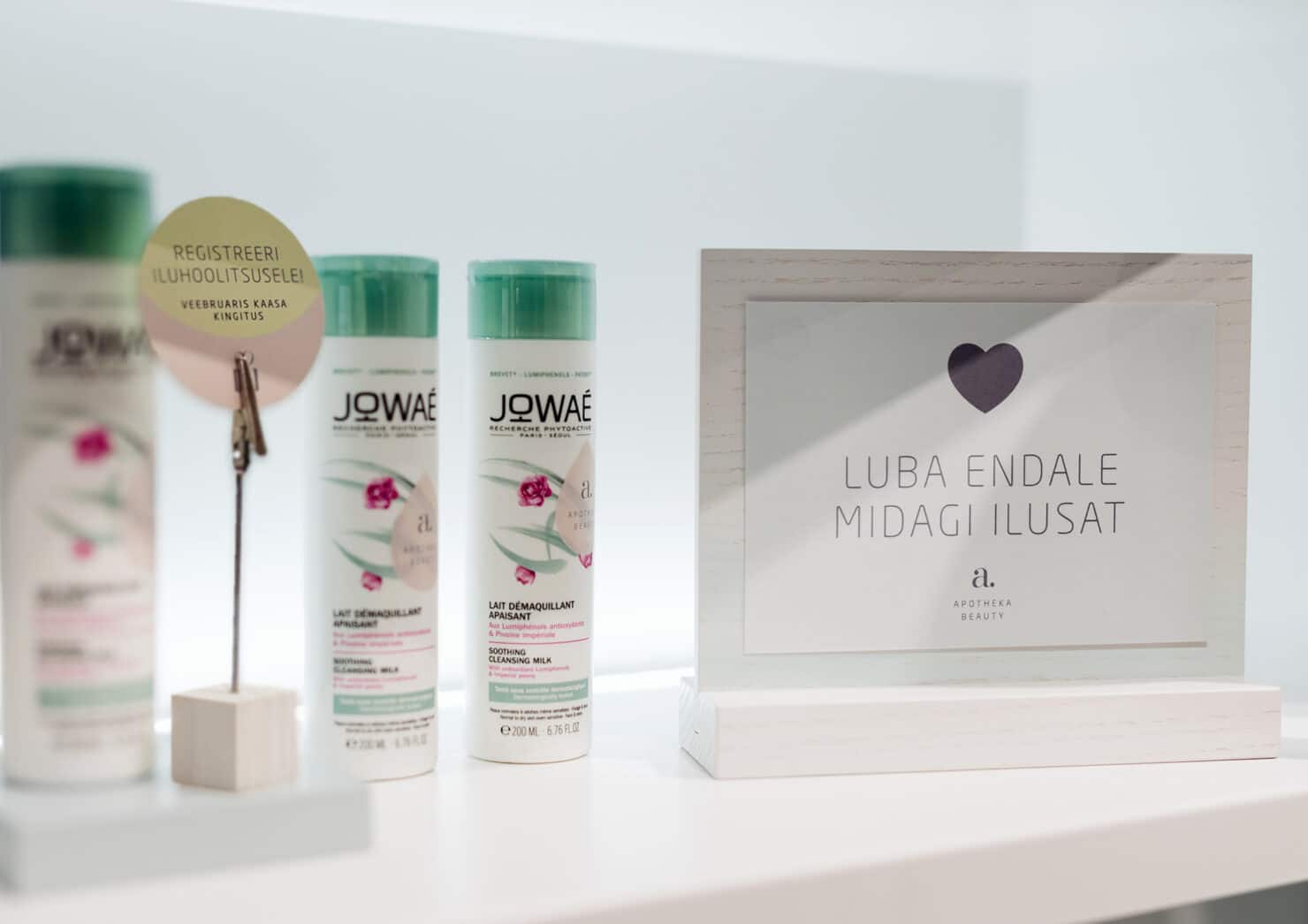
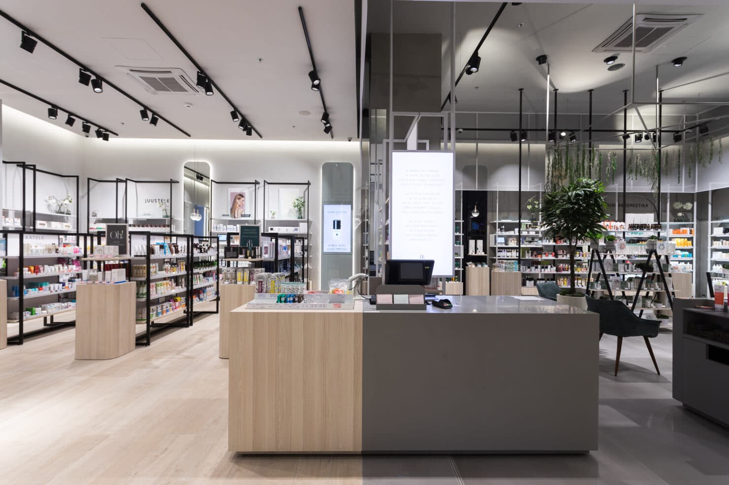
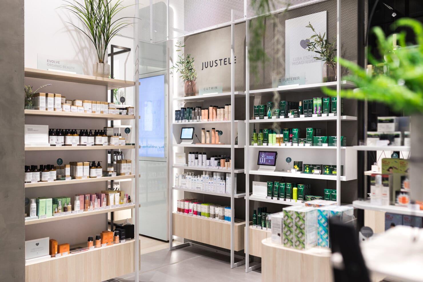
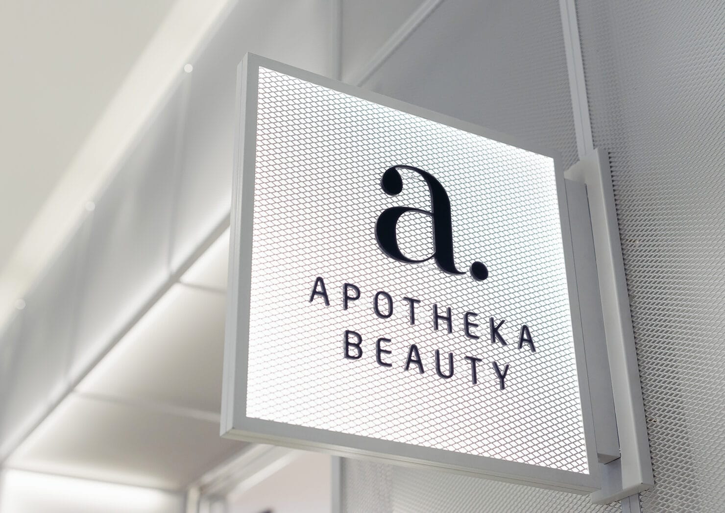
Thus, we created a beautiful brand, the gentle, yet sound characteristics of which are visible throughout each element in the store up to the smallest details. We worked up a distinctive style for the retail setup as a whole that consists of design solution for the facade, wayfinding system, signs, displays and communications, including branded products and other brand touchpoints. The brand is dreamingly chatting with you. Everywhere you look it shares knowledge or just offers inspiration. This carefree dreamtalk is represented in the store environment.
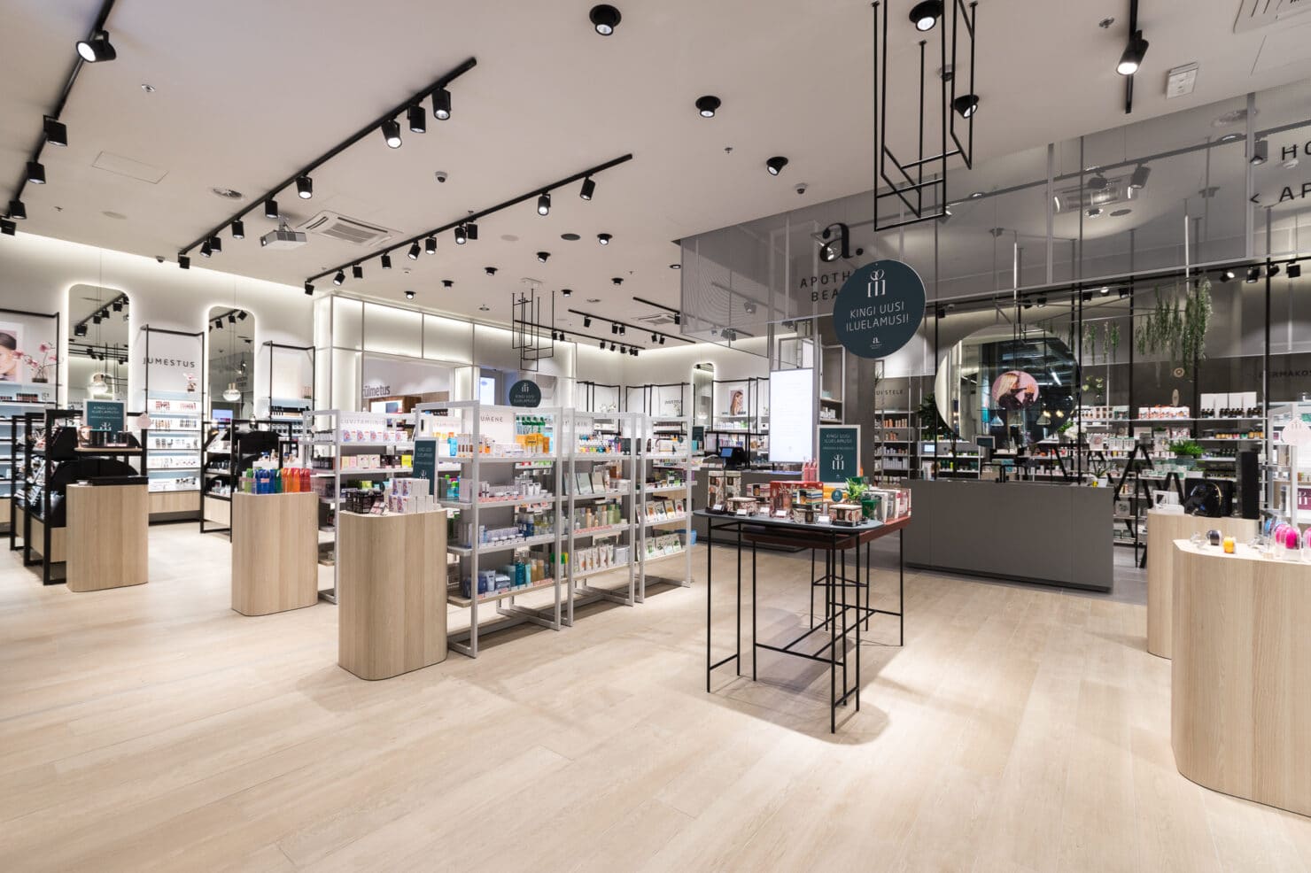
In cooperation with NOBE Design and Brand Manual, we could create a concept, that is really different, yet quite familiar. And we love it!
Team
- Sandra Goroško – Creative Lead
- Kristian Kirsfeldt – Creative Lead
- Kadri Pukk – Project Lead
- Siim Tikk – Designer
- Mart Lankots – Production
- –
Partners
- NOBE – Architecture
- Andres Raudjalg – Photography
